-
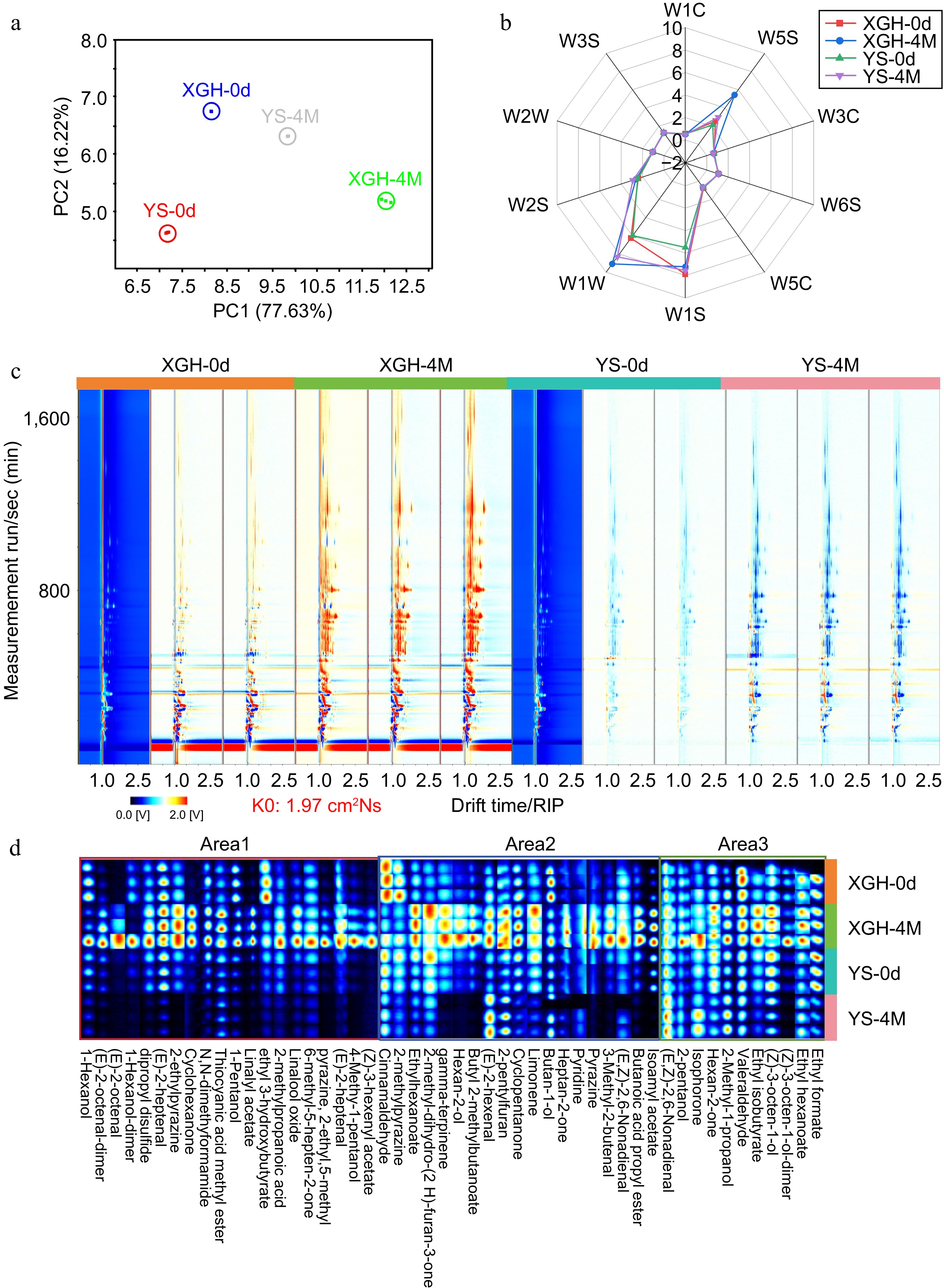
Figure 1.
E-nose analysis of sweet potato and GC-IMS two-dimensional spectral analysis of volatile flavor compounds in sweet potato. (a) PCA. (b) Radar chromatogram. (c) GC-IMS two-dimensional spectrum of sweet potato in XGH and YS. (d) Volatile flavor fingerprint. The red vertical line at the horizontal coordinate of 1.0 is the reactive ion peak (RIP), and each point on both sides of the peak represents volatile organic matter. The color represents the substance concentration, white represents a low concentration, red represents a high concentration, and the deeper the color is, the greater the concentration.
-
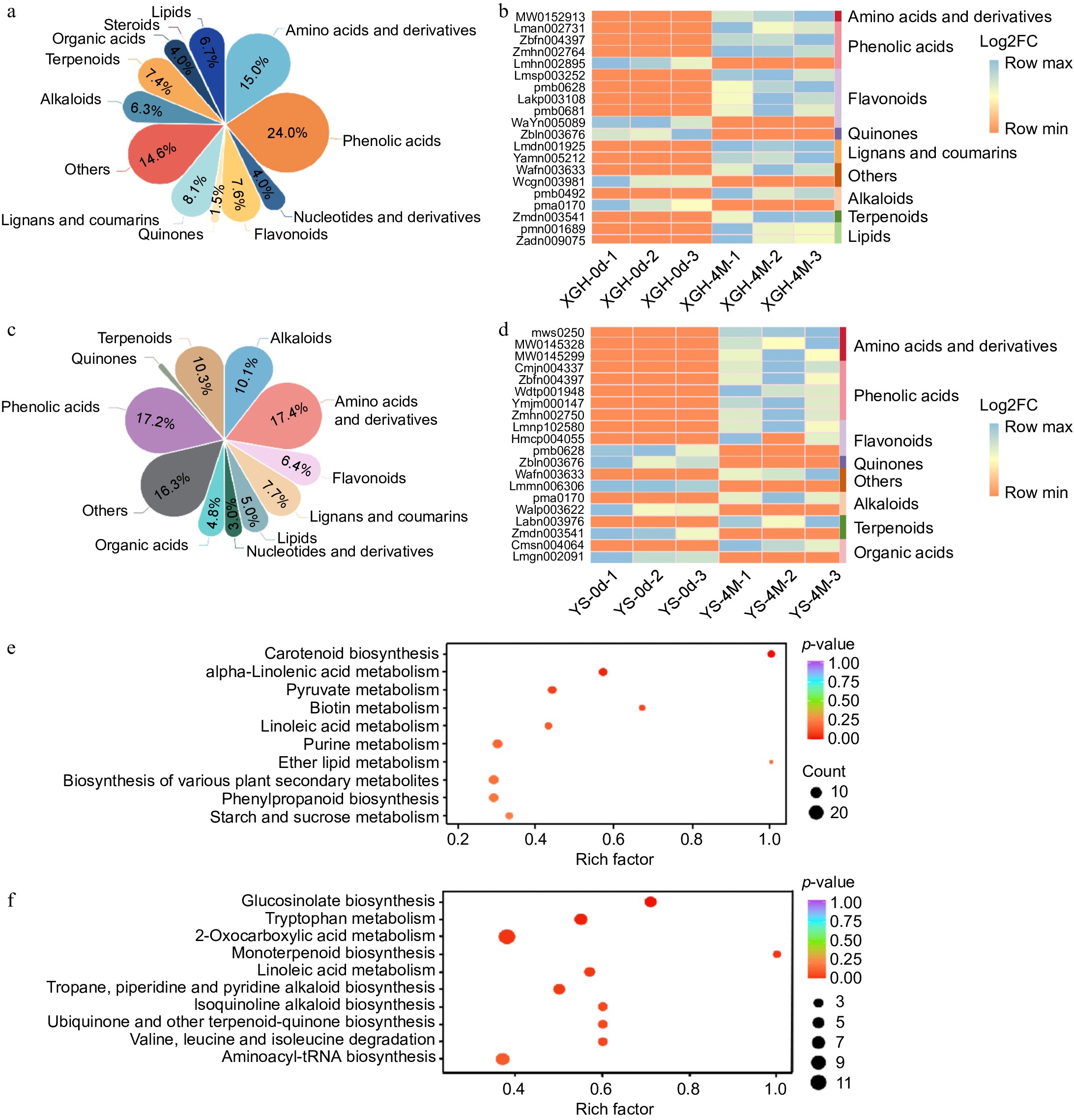
Figure 2.
Analysis of metabolome data. (a) Classification and content of differential metabolites in XGH-0d vs XGH-4M. (b) Heat maps displaying 20 most significantly altered metabolites in XGH-0d vs XGH-4M. (c) Classification and content of differential metabolites in YS-0d vs YS-4M. (d) Heat maps displaying 20 most significantly altered metabolites in YS-0d vs YS-4M. (e) Enrichment of the top 10 metabolic pathways based on KEGG analysis in the XGH-0d vs XGH-4M. (f) Enrichment of the top 10 metabolic pathways based on KEGG analysis in the YS-0d vs YS-4M.
-
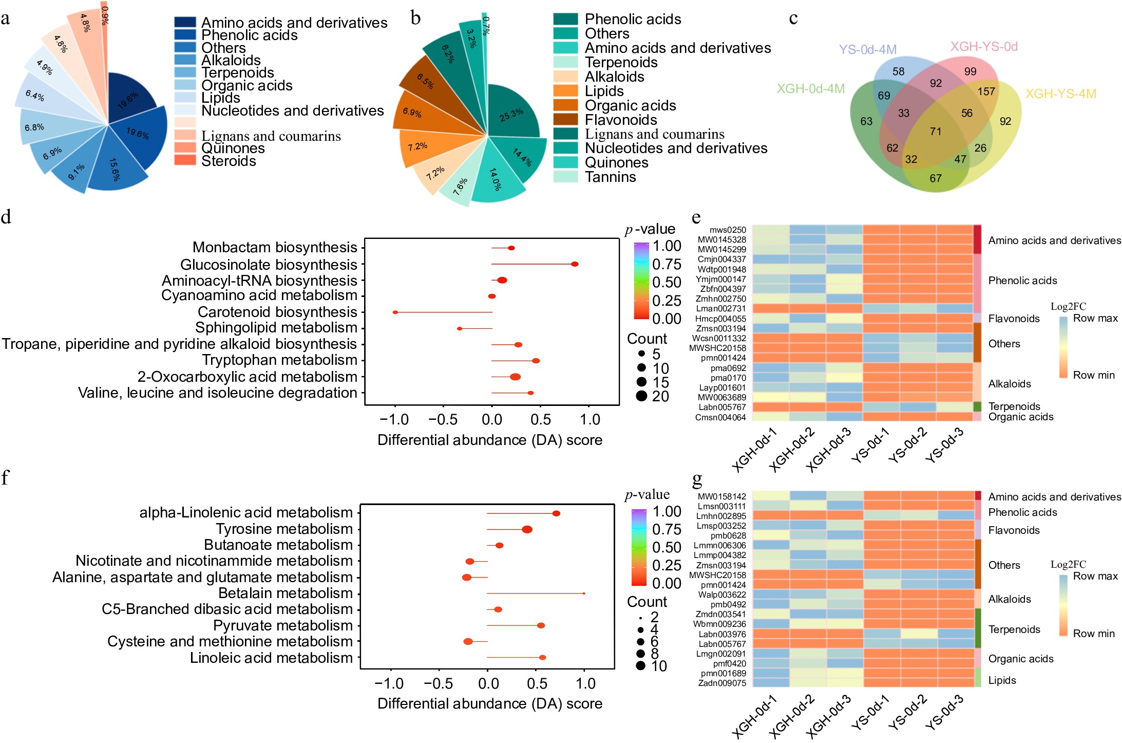
Figure 3.
Analysis of metabolome data. (a) Classification and content of differential metabolites in YS-0d vs XGH-0d. (b) Classification and content of differential metabolites in YS-4M vs XGH-4M. (c) Venn diagram illustrating the overlapping metabolites between XGH-0d vs XGH-4M, YS-0d vs YS-4M, YS-0d vs XGH-0d, and YS-4M vs XGH-4M comparisons. (d) Enrichment of the top 10 metabolic pathways based on KEGG analysis in the YS-0d vs XGH-0d. (e) Heat maps displaying 20 most significantly altered metabolites in YS-0d vs XGH-0d. (f) Enrichment of the top 10 metabolic pathways based on KEGG analysis in the YS-4M vs XGH-4M. (g) Heat maps displaying 20 most significantly altered metabolites in YS-4M vs XGH-4M.
-
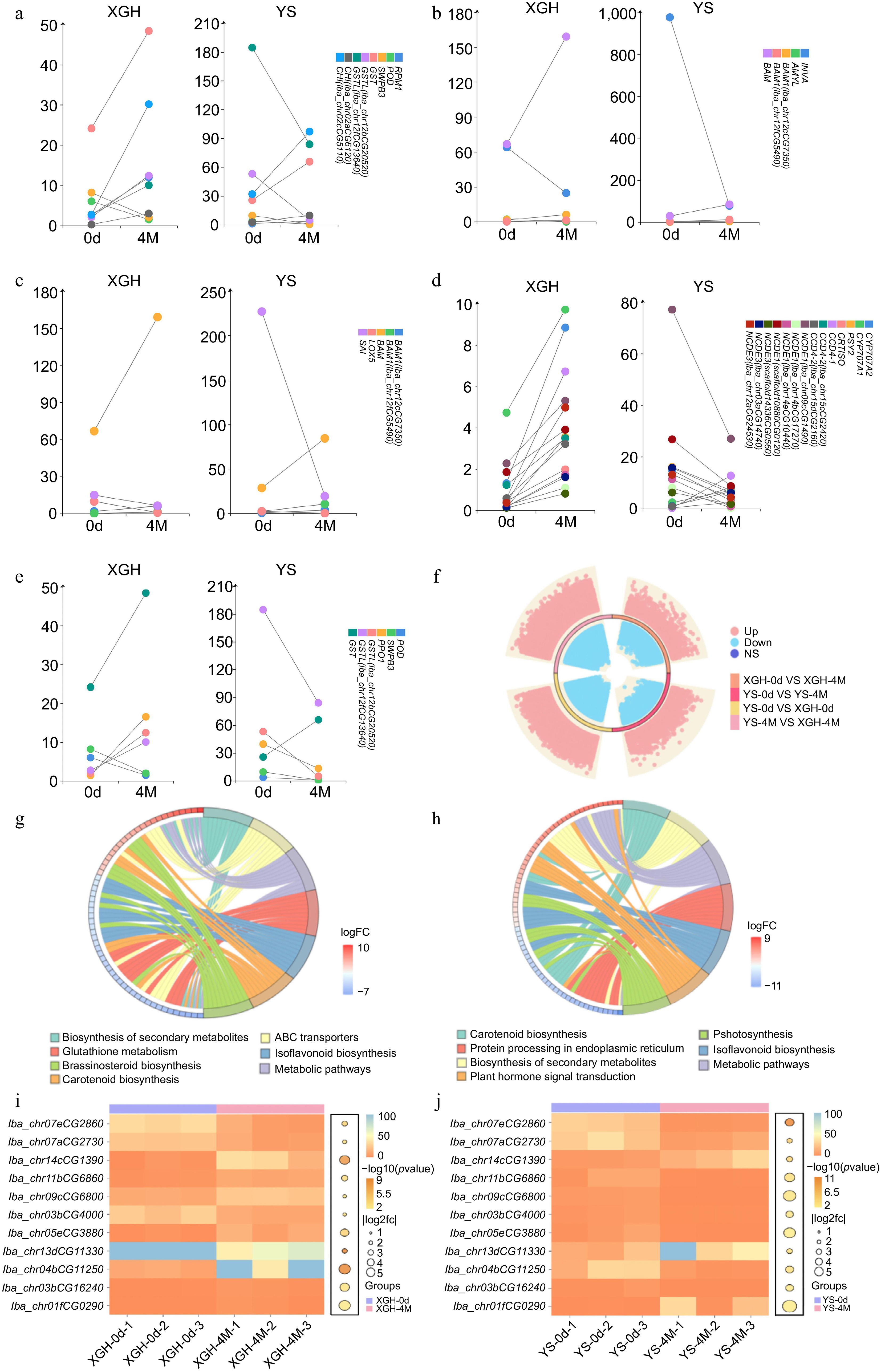
Figure 4.
Analysis of transcriptome data. (a)−(e) Dumbbell plot of common gene expression (fpkm) in XGH-0d vs XGH-4M and YS-0d vs YS-4M. (f) Diagram of a ring volcano between XGH-0d vs XGH-4M, YS-0d vs YS-4M, YS-0d vs XGH-0d, and YS-4M vs XGH-4M comparisons. (g) Enrichment of KEGG top seven pathways for DEGs in XGH-0d vs XGH-4M. (h) Enrichment of KEGG top seven pathways for DEGs in YS-0d vs YS-4M. (i) Texture shared gene expression bubble heat map in XGH-0d vs XGH-4M. (j) Texture shared gene expression bubble heat map in YS-0d vs YS-4M.
-
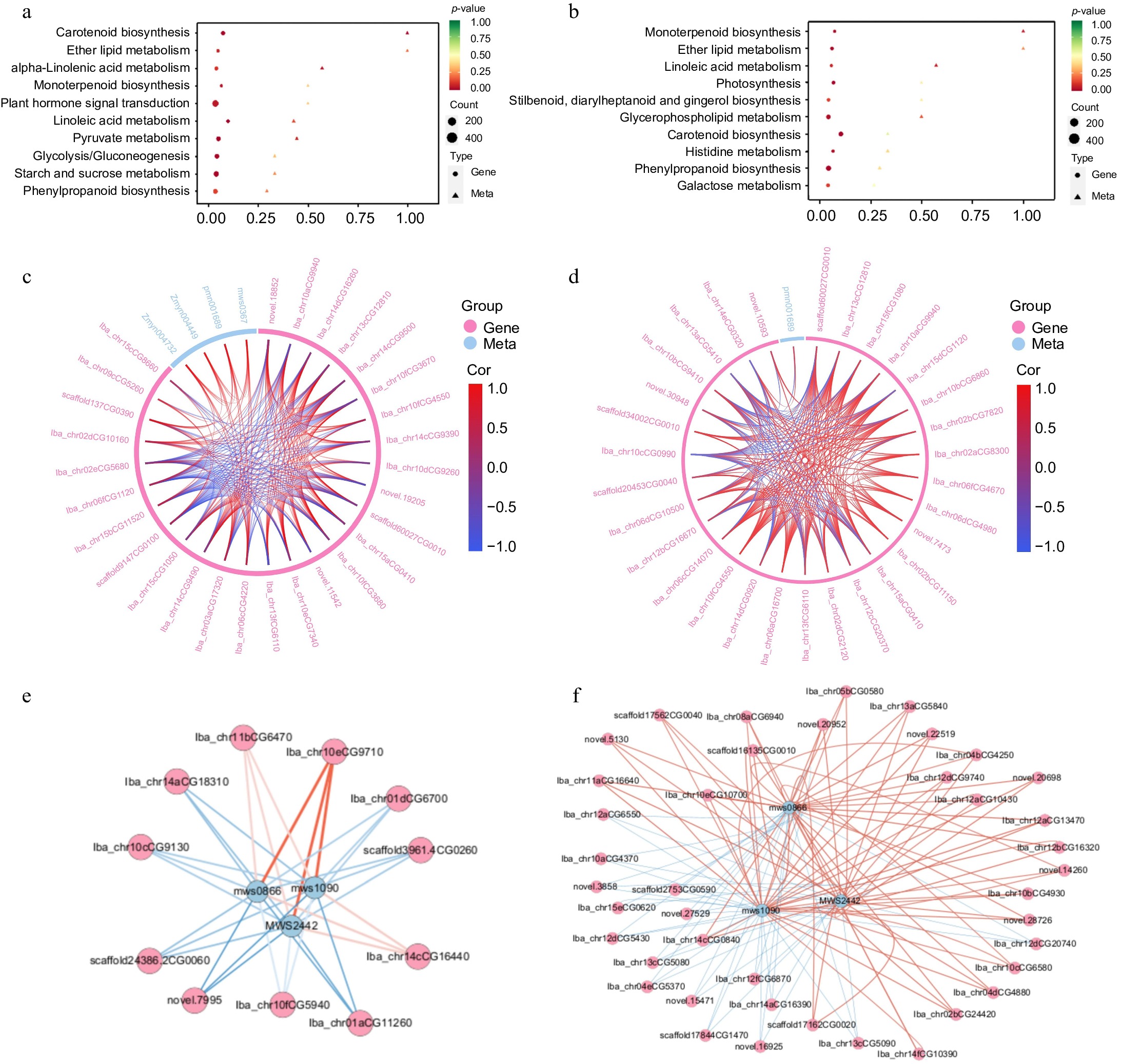
Figure 5.
Combined transcription and metabolism analysis. (a) KEGG co-enrichment analysis of DEMs and DEGs in XGH-0d vs XGH-4M. (b) KEGG co-enrichment analysis of DEMs and DEGs in YS-0d vs YS-4M. (c) Chord diagram of DEMs and DEGs enriched in the α-linolenic acid metabolic pathway in XGH-0d vs XGH-4M. (d) Chord diagram of DEMs and DEGs enriched in the α-linolenic acid metabolic pathway in YS-0d vs YS-4M. (e) Correlation network diagram of DEMs and DEGs enriched in starch and sucrose metabolism pathway in YS-0d vs YS-4M. (f) Correlation network diagram of DEMs and DEGs enriched in starch and sucrose metabolism pathway in XGH-0d vs XGH-4M.
-
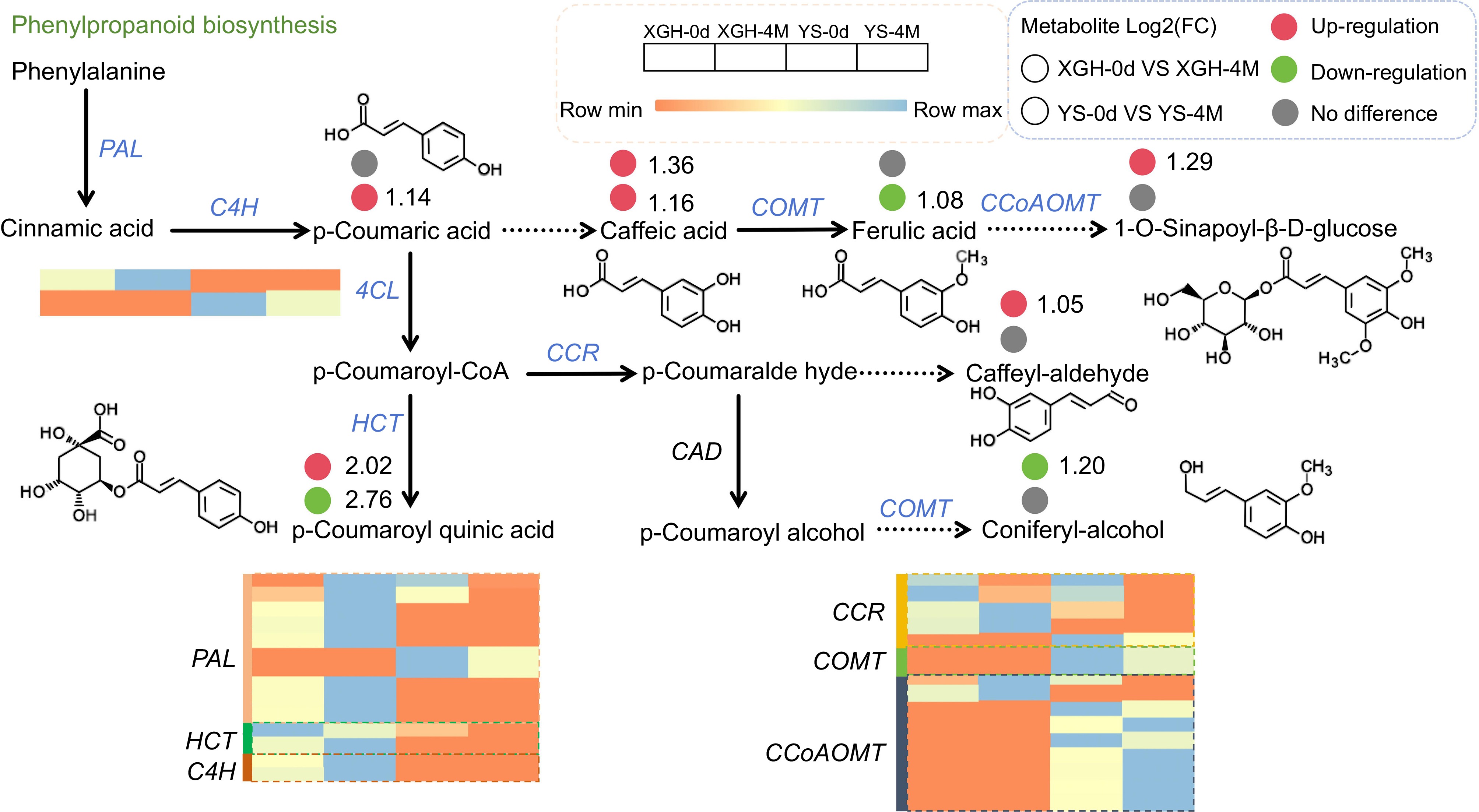
Figure 6.
Changes of DEMs and DEGs in the phenylpropanoid biosynthesis pathway.
-
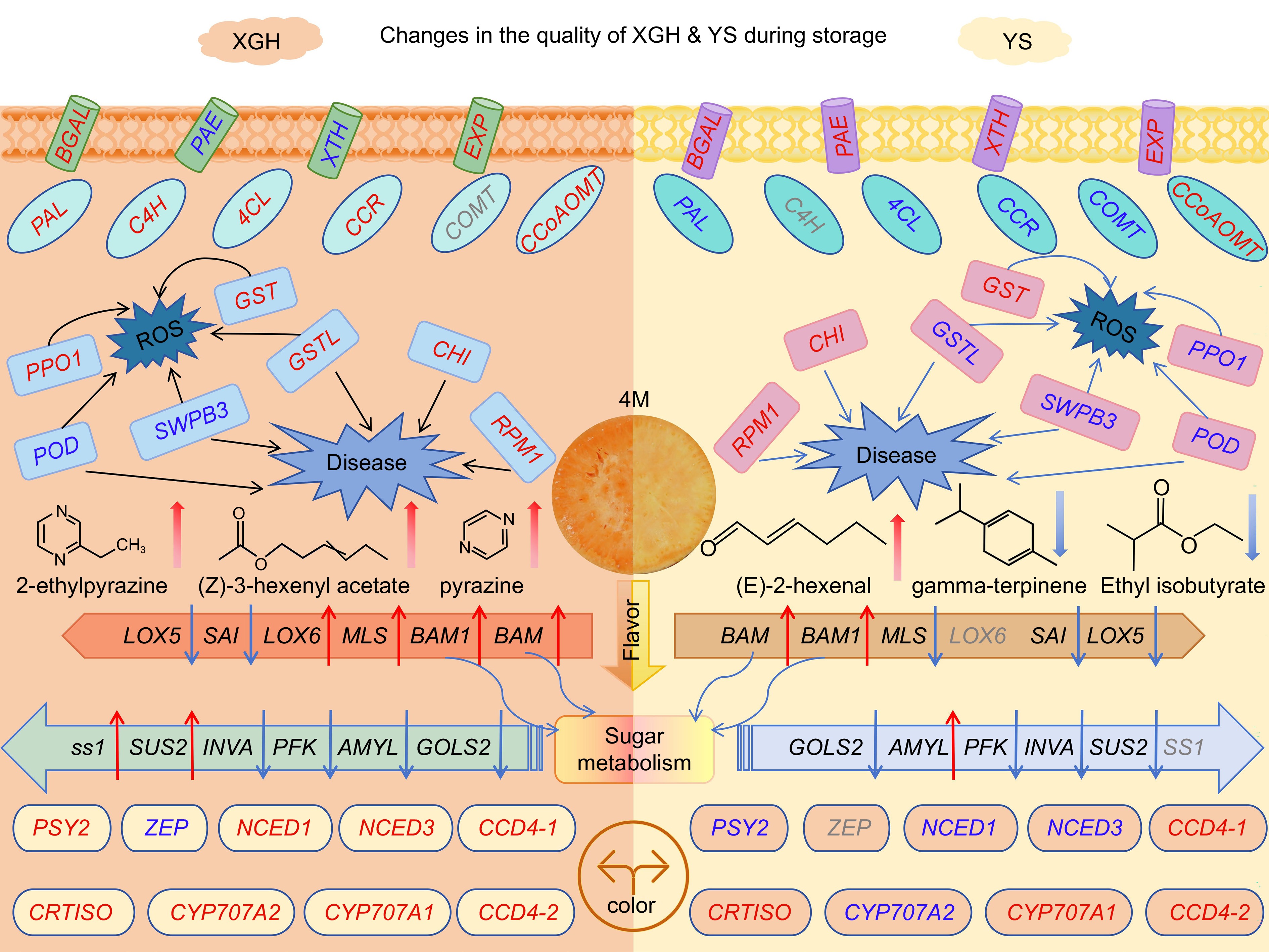
Figure 7.
A model of genes and metabolites related to quality deterioration of different varieties of sweet potato. The red font indicates up-regulated gene expression, and the blue font indicates down-regulated gene expression. The red arrow indicates an increase, and the blue arrow indicates a decrease. Gray fonts indicate that the gene is not present.
Figures
(7)
Tables
(0)