-
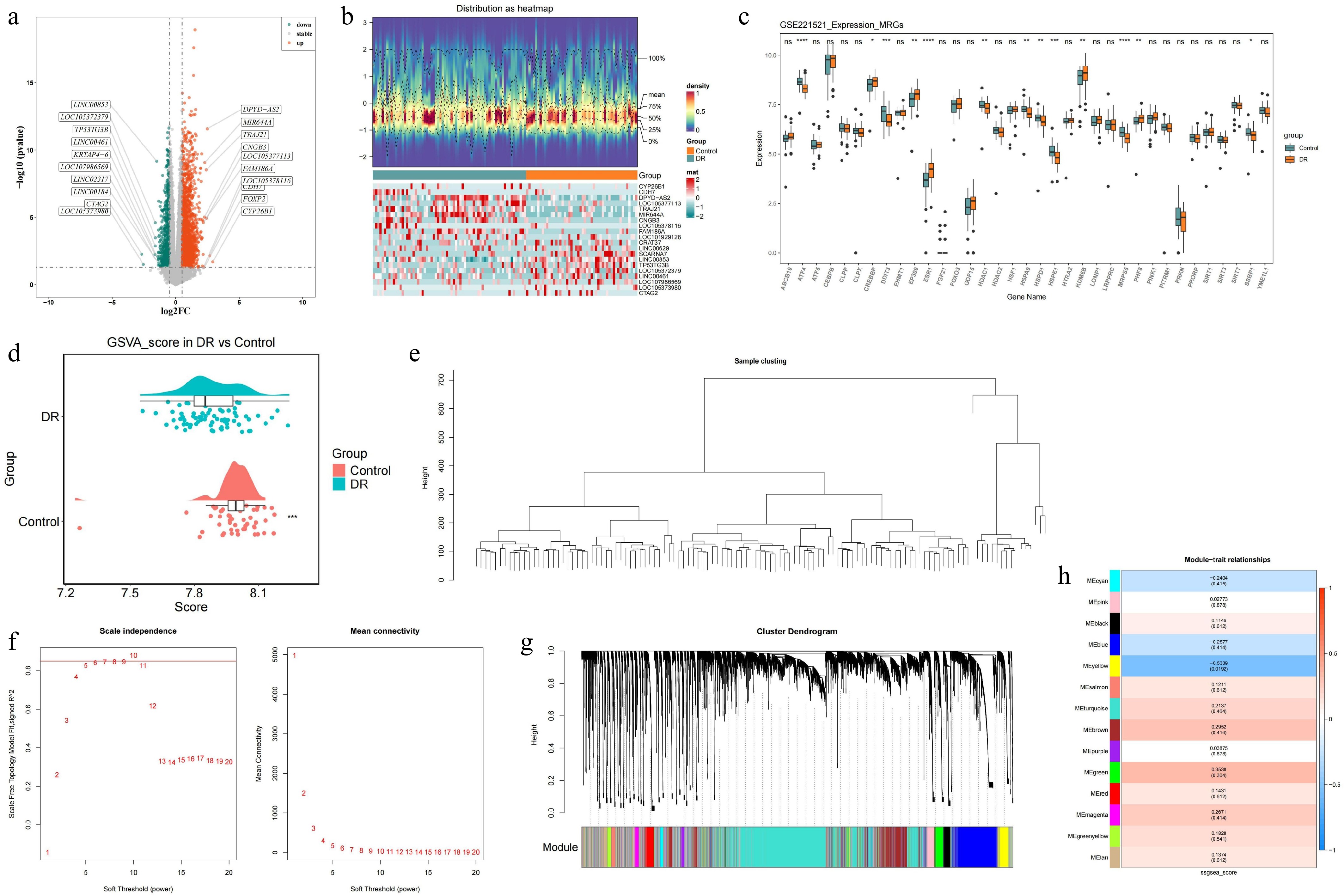
Figure 1.
Identification of DEGs in blood samples of DR patients and construction of the WGCNA co-expression network in GSE221521 (training set). (a) Volcano plot of the DEGs. (b) Heatmap of the DEGs. (c) The Wilcoxon test for MRGs. (d) Analysis of differences in ssGSEA scores for MRGs. (e) Hierarchical clustering by Euclidean distances of gene expression. (f) Analysis of the scale-free fit index and the mean connectivity for different soft thresholding powers. (g) Dendrogram of differentially expressed genes clustered according to a dissimilarity measure. (h) Heatmap of correlations between different modules and clinical traits.ns p-value > 0.05, * p-value < 0.05, ** p-value < 0.01, *** p-value < 0.001, **** p-value < 0.0001.
-
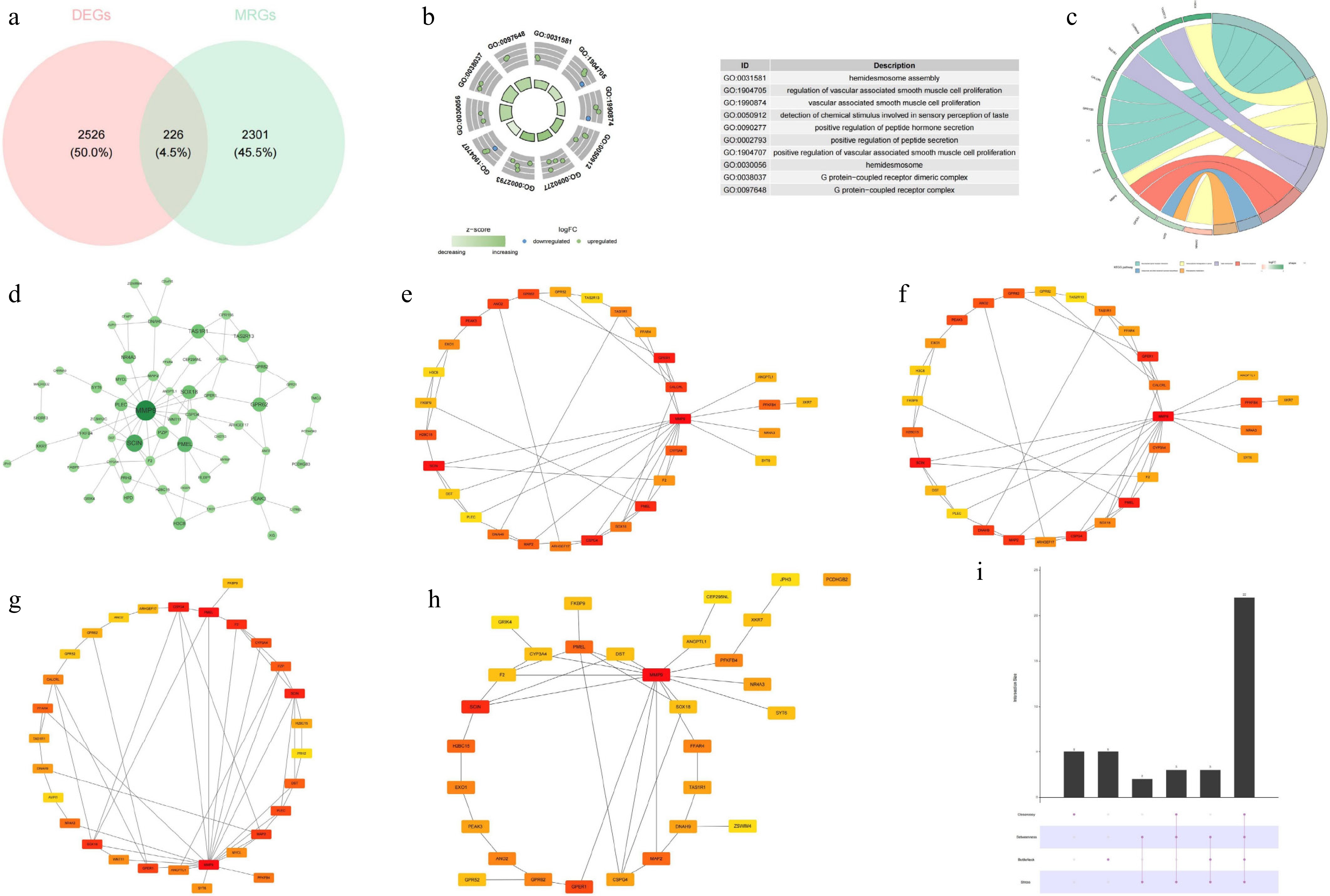
Figure 2.
Identification of candidate genes, GO–KEGG enrichment analysis, and constructin of the PPI network. (a) Venn diagram of the candidate genes. (b) GO enrichment analysis. (c) KEGG enrichment analysis. (d) PPI network of the candidate genes. (e) Top 30 hub genes identified by the closeness algorithm. (f) Top 30 hub genes identified by the betweenness algorithm. (g) Top 30 hub genes identified by the bottleneck algorithm. (h) Top 30 hub genes identified by the stress algorithm. (i) UpSet plot showing the intersection of the top 30 hub genes identified by the four algorithms.
-
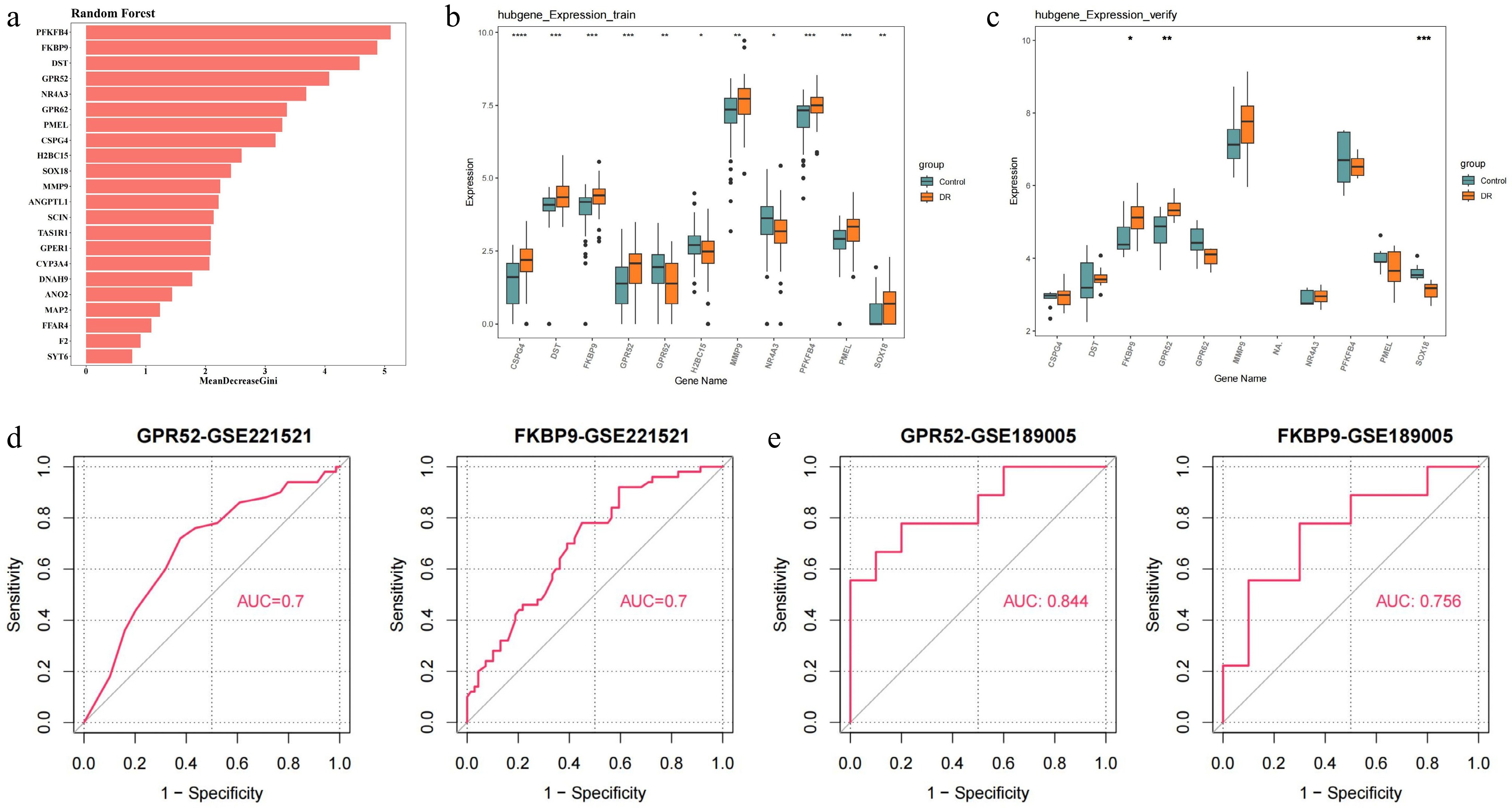
Figure 3.
Identification and validation of candidate feature genes. (a) Random forest analysis. (b) The expression of candidate feature genes in training dataset (GSE221521). (c) The expression of candidate feature genes in validation dataset (GSE189005). (d) ROC curves of feature genes in the training dataset. (e) ROC curves of feature genes in the validation dataset. * p-value < 0.05, ** p-value < 0.01, *** p-value < 0.001, **** p-value < 0.0001.
-
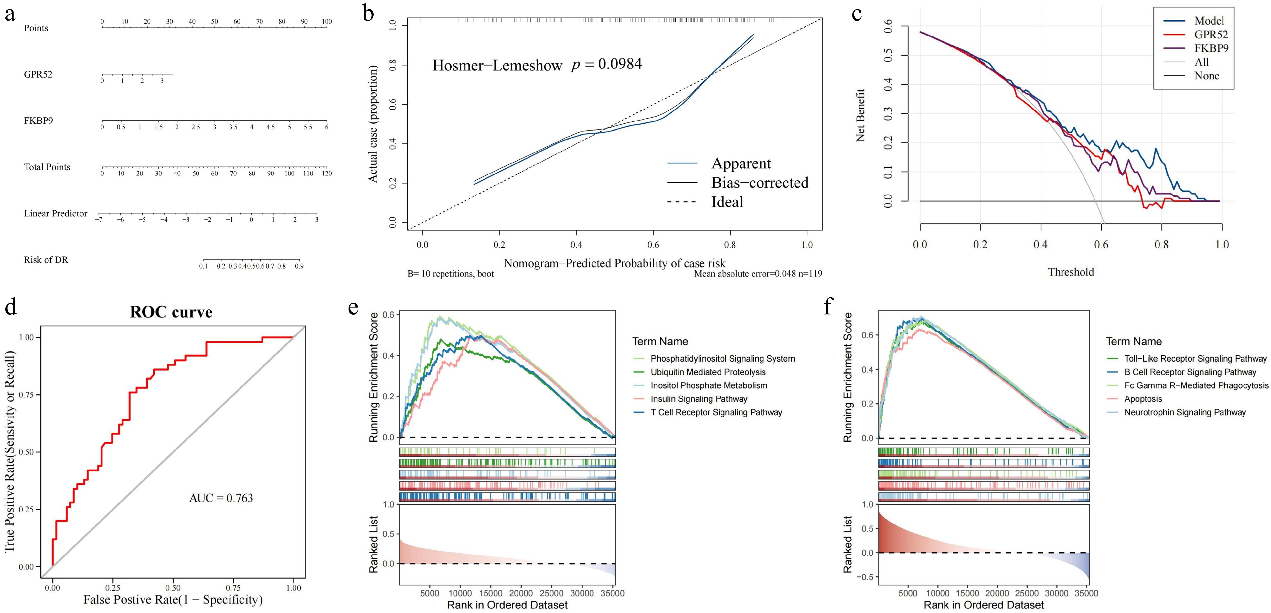
Figure 4.
Construction of the DR diagnosis nomogram and GSEA enrichment analysis for GPR52 and FKBP9. (a) The nomogram for predicting the risk of DR with GPR52 and FKBP9. (b) Calibration curves of the DR prediction nomogram. (c) The decision curve analysis of the nomogram. (d) The ROC curve of the nomogram. (e) GSEA enrichment analysis of GPR52. (f) GSEA enrichment analysis of FKBP9.
-
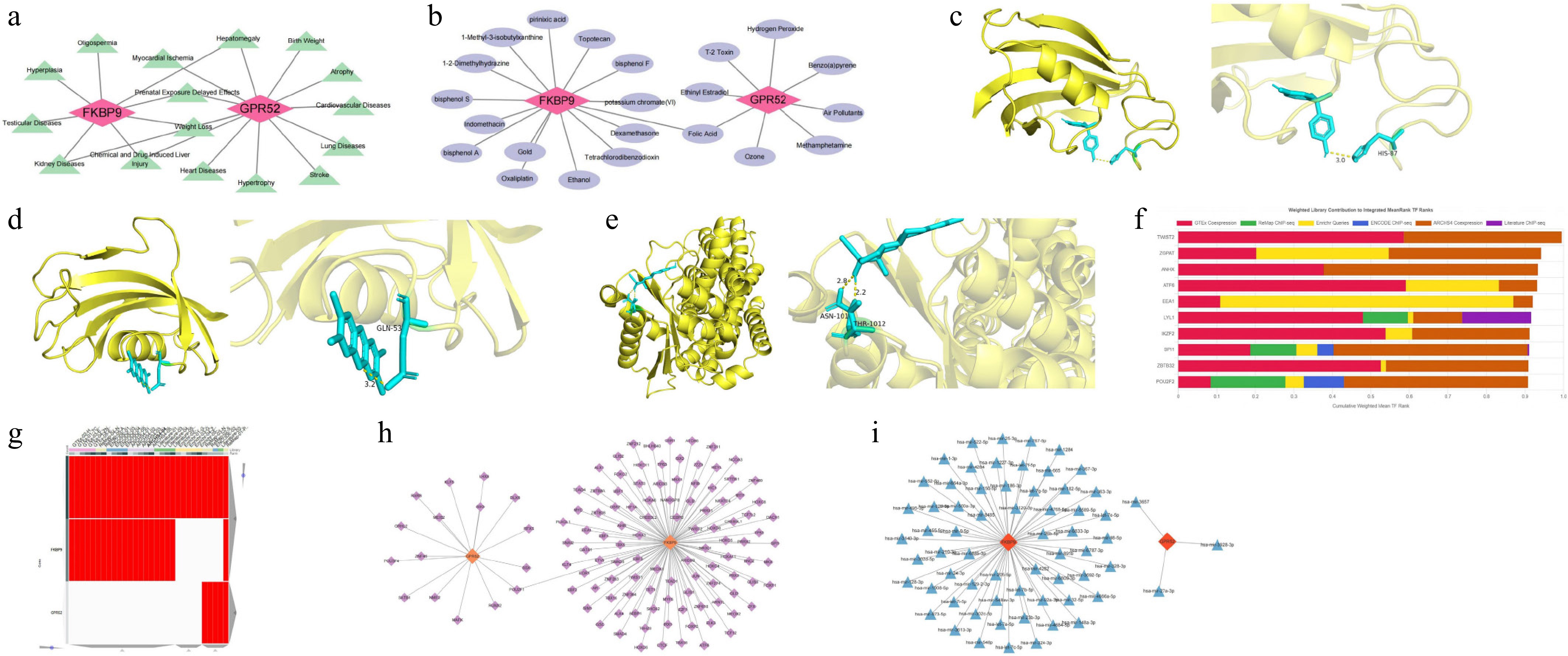
Figure 5.
Potential molecular mechanisms and regulatory networks of GPR52 and FKBP9. (a) Correlations between the biomarkers and clinical disease. (b) Drug–target network of the biomarkers. (c) Molecular docking model of FKBP9 and bisphenol A. (d) Molecular docking model of FKBP9 and tetrachlorodibenzodioxin. (e) Molecular docking model of GPR52 and ethinyl estradiol. (f) Top 10 TFs identified by the ChEA3 database. (g) The heatmap of TFs predicted by different databases (ENCODE, ReMap, GTEx, Enrichr, and ARCHS4). (h) TF–biomarker regulatory network. (i) miRNA–biomarker regulatory network.
-
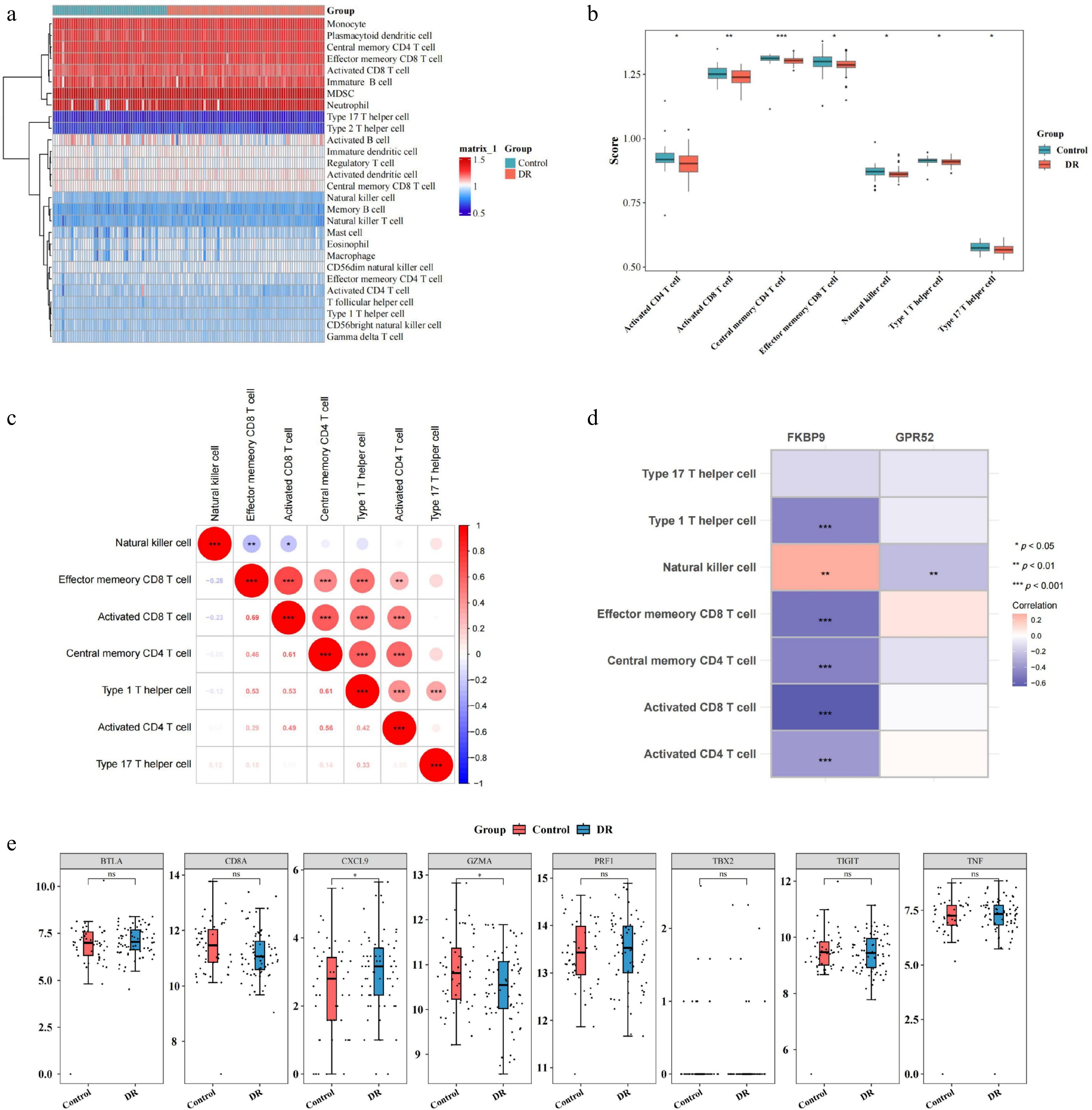
Figure 6.
Relationship between two biomarkers (GPR52 and FKBP9) and immune cell infiltration. (a) Heatmap of immune cell infiltration in the DR and control groups. (b) Differences in infiltrated immune cells between the DR and control groups. (c) Correlation analysis between immune cells. (d) Correlation between differentially infiltrated immune cells and biomarkers. (e) Differences in the expression of specific immunological activity-related genes between the DR and control groups. * p-value < 0.05, ** p-value < 0.01, *** p-value < 0.001.
-
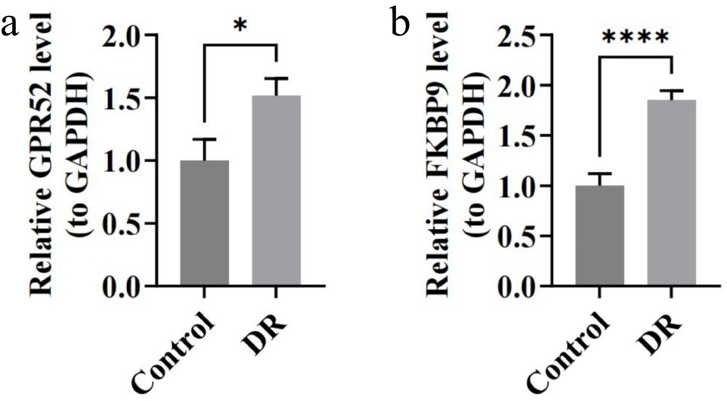
Figure 7.
The expression of biomarkers in blood samples of DR patients by RT-qPCR. (a) Relative expression of GPR52. (b) Relative expression of FKBP9. * p < 0.05, **** p-value < 0.0001.
-
Primers Sequences GPR52-F ATGACCGAAGAGCCCGATTC GPR52-R CGCTGTTGGAGAGGCTGTAT FKBP9-F AGATGCAGGGTGGGCTTTG FKBP9-R ATGCAAAGGAGTAGGCCCAG GAPDH-F CGAAGGTGGAGTCAACGGATTT GAPDH-R ATGGGTGGAATCATATTGGAAC Table 1.
Primers used for RT-qPCR.
Figures
(7)
Tables
(1)