-
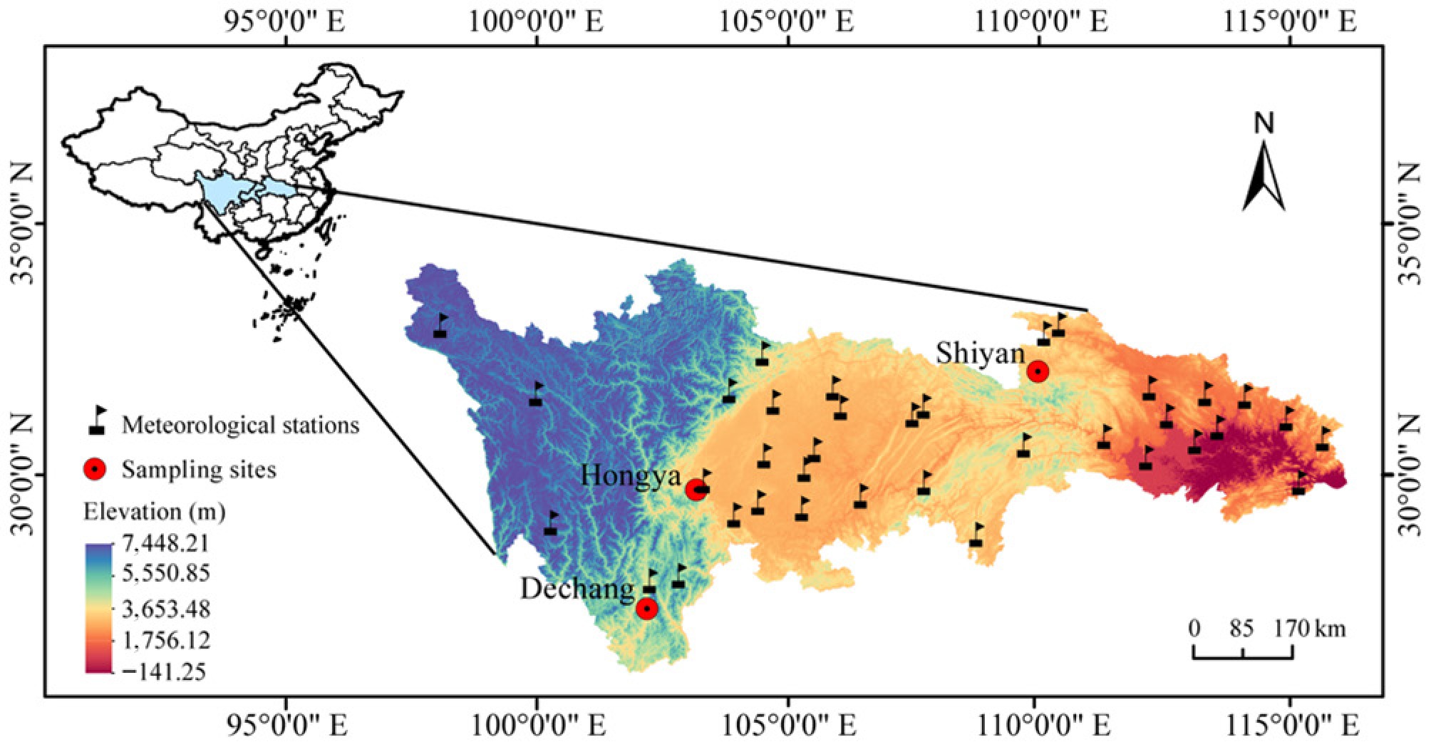
Figure 1.
The spatial distribution of the sampling sites and the 36 meteorological stations selected for this study. The scale bars in the panels represent a horizontal ground distance of 170 km.
-
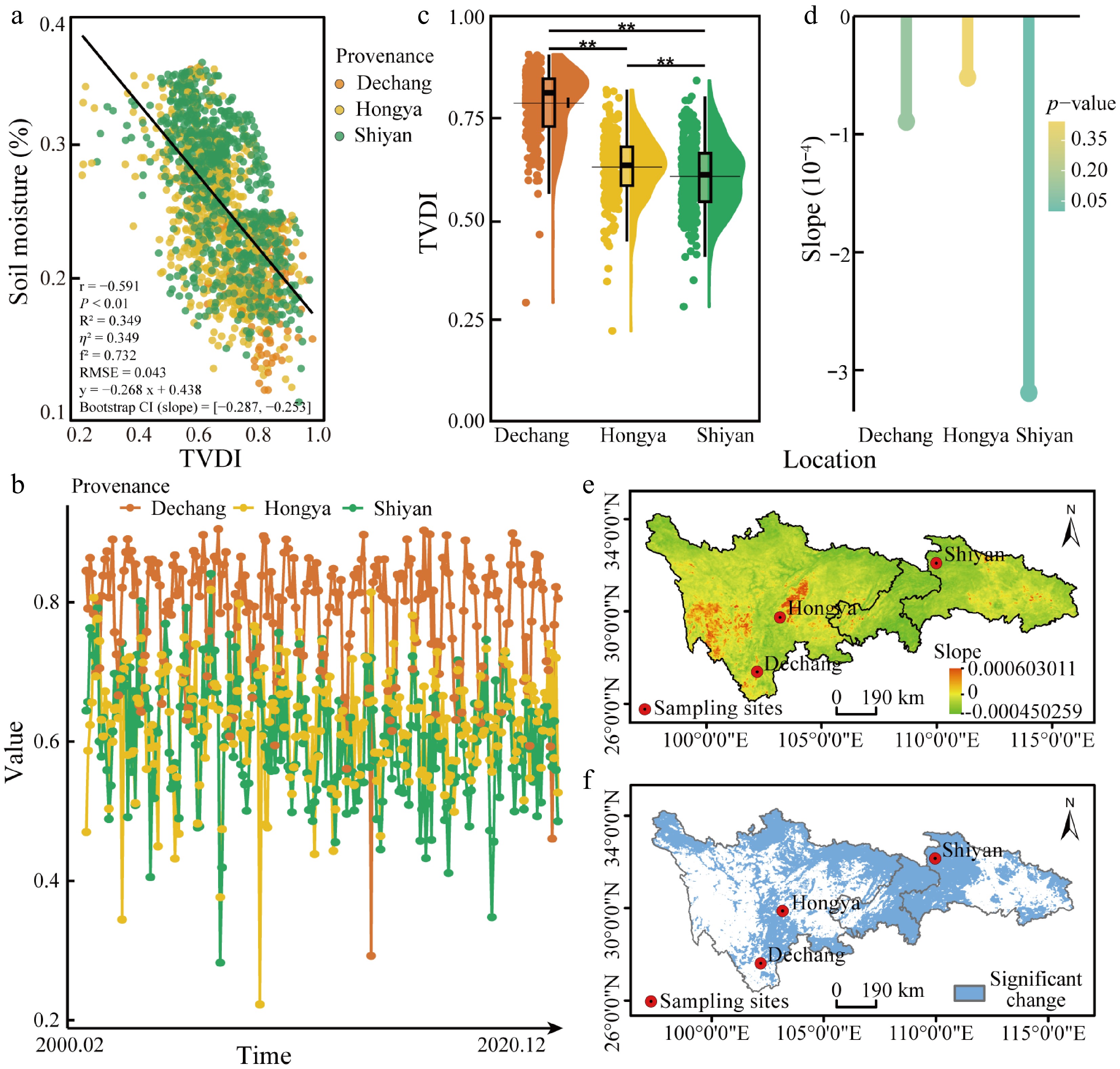
Figure 2.
Validation of TVDI results and its variation across the three provenance regions. (a) Correlation between TVDI and soil moisture. Each data point represents a meteorological station, and colors are assigned based on the Euclidean distance to the three sampling points. The color indicates the nearest sampling point to each meteorological station. The black solid line represents the linear regression trend for all the data. (b) Monthly TVDI of the three provenances from February 2000–December 2020. (c) Annual mean TVDI from 2000 to 2020; (d) Trends and significance of TVDI changes across the three provenance regions from 2000 to 2020. (e) Theil-Sen slope estimates of TVDI in the study area; (f) Mann-Kendall test for the significance of TVDI trends in the study area. The scale bars in these panels represent a horizontal ground distance of 190 km.
-
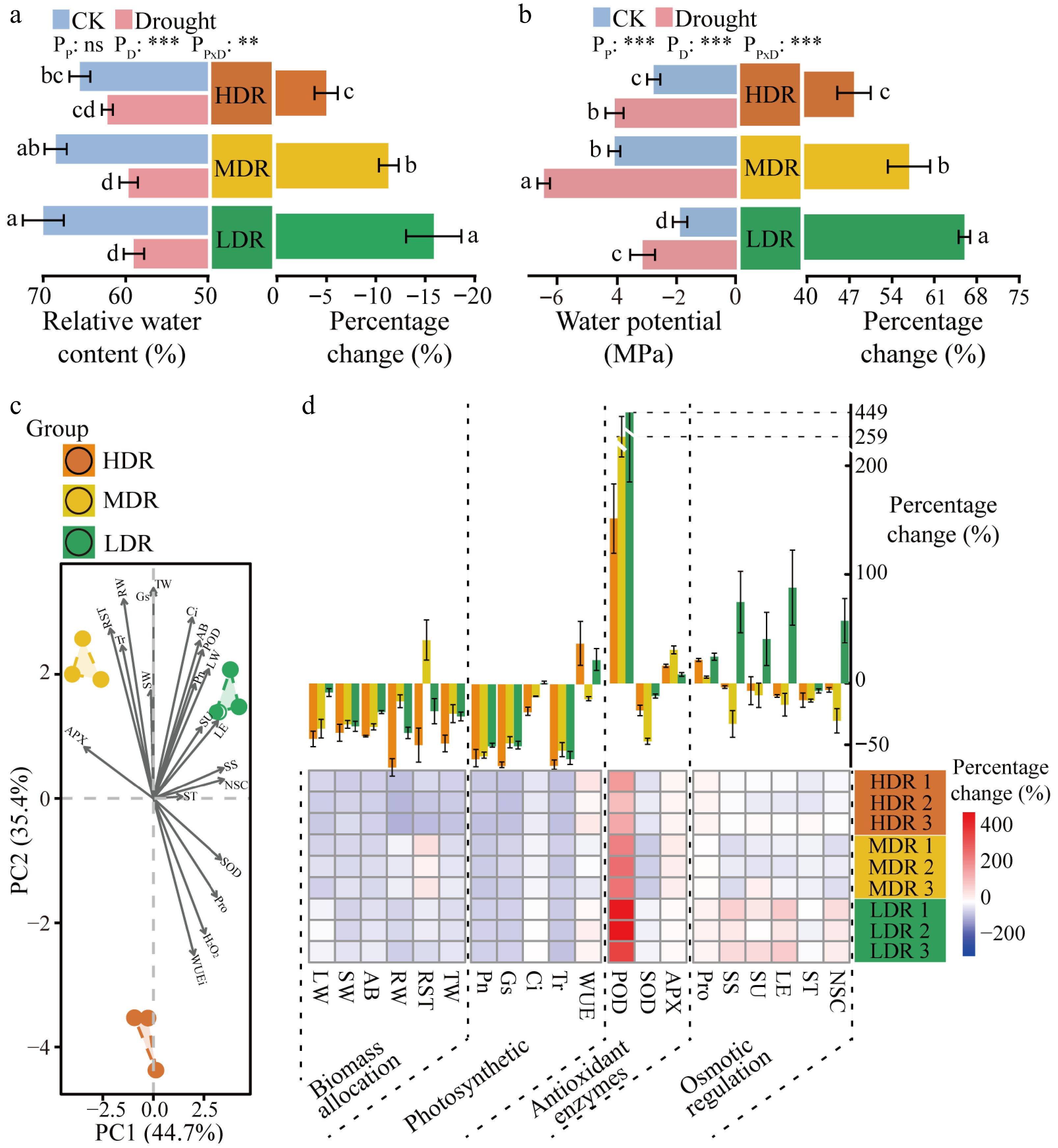
Figure 3.
Water status and physiological changes in different provenances of C. lanceolata under drought stress. (a) Relative water content and relative changes in leaves of different C. lanceolata under drought stress; Provenances are color-coded: orange, HDR; yellow, MDR; green, LDR. (b) Water potential and relative changes in leaves of different C. lanceolata under drought stress. The values were means ± SD. Different lowercase letters on the bars represent significant differences (p < 0.05) based on ANOVA with Tukey's honestly significant difference test. PP, provenance effect; PD, drought effect; PP × D, provenance × drought interaction. (c) PCA of relative changes in physiological traits of C. lanceolata from the three provenance regions; (d) Relative changes in physiological traits of C. lanceolata from three provenance regions under drought stress. The bar plot (top) shows the mean percentage change of each physiological trait for each provenance under drought stress, expressed as mean ± SD. The heatmap (bottom) displays the percentage change of each trait across three biological replicates per provenance, highlighting individual-level variability. The abbreviations are provided in Section 'Recalculation of leaf physiological indices'.
-
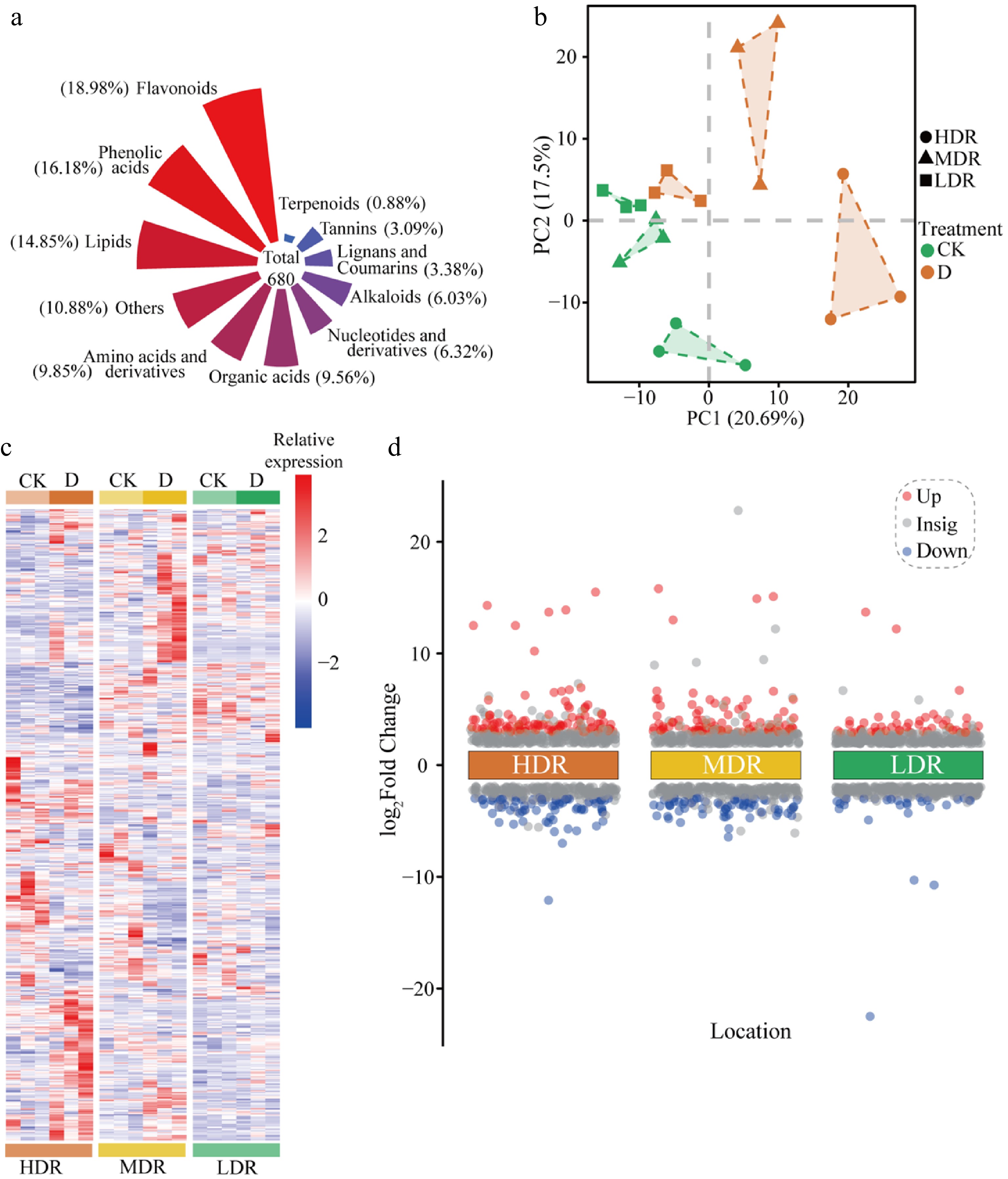
Figure 4.
Metabolomics overview and PCA analysis of C. lanceolata from different provenance regions under drought stress. (a) Proportion of each metabolite. (b) PCA of all detected metabolites. (c) Hierarchical cluster analysis and heatmap of all metabolites detected in plant leaves from each treatment. CK, Control treatment. D, Drought treatment. (d) Significantly upregulated and downregulated metabolites in C. lanceolata leaves. Red represents significantly upregulated metabolites, while blue represents significantly downregulated metabolites.
-
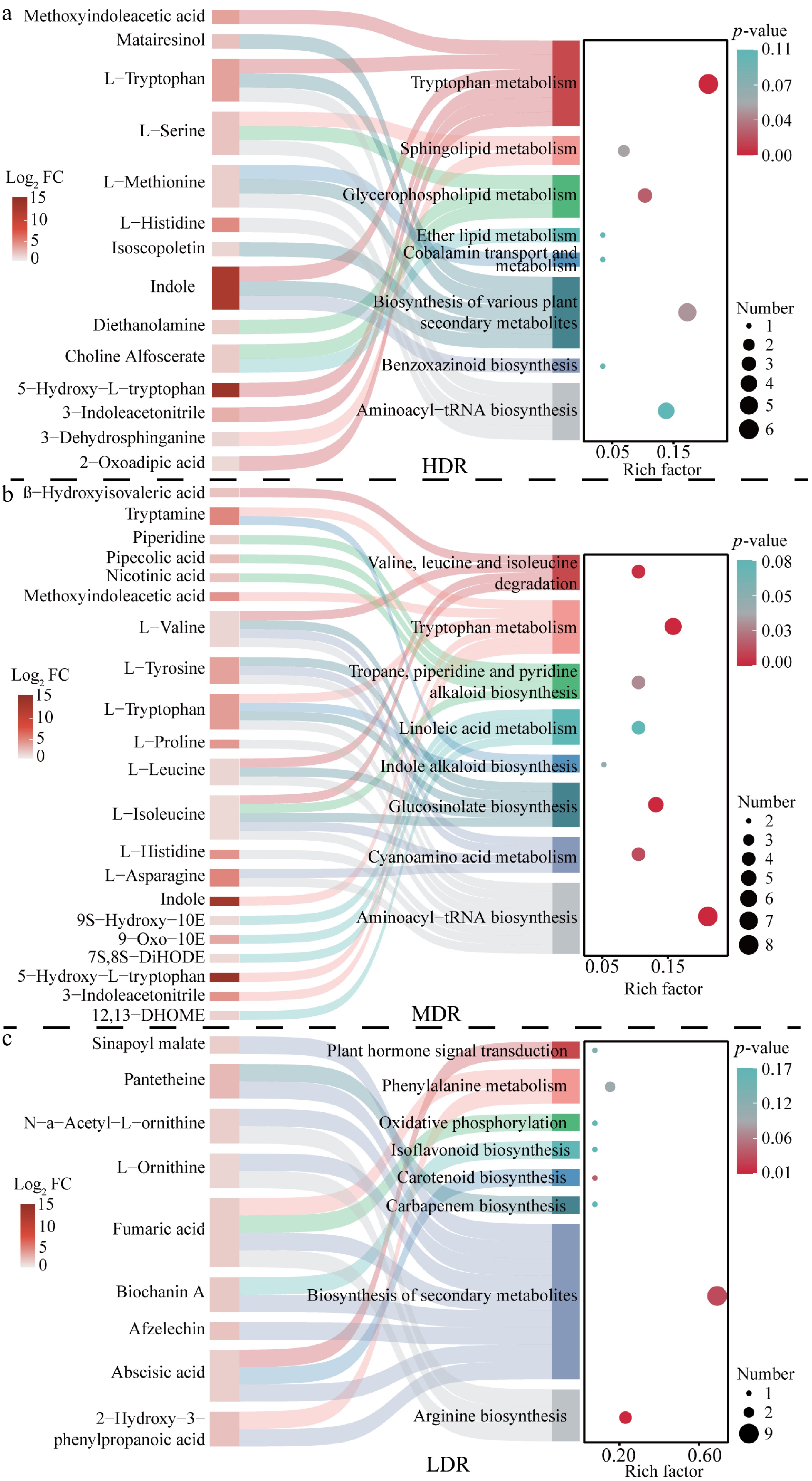
Figure 5.
KEGG enrichment analysis of significantly upregulated metabolites in C. lanceolata from different provenance regions. The figure combines a KEGG enrichment bubble plot and a Sankey diagram. In the bubble plot, the horizontal axis shows the Enrich factor (number of differentially abundant metabolites mapped to a pathway divided by total metabolites in that pathway), and the vertical axis lists pathway names. Bubble size represents the number of upregulated metabolites, and bubble color indicates the adjusted p-value (red to blue: higher to lower significance). The Sankey diagram shows connections between enriched pathways (right) and corresponding metabolites (left); pathway colors are manually assigned for distinction, and metabolite node color represents log2 fold change (Log2 FC) between drought and control groups. Flow width reflects the number of metabolite-pathway associations.
-
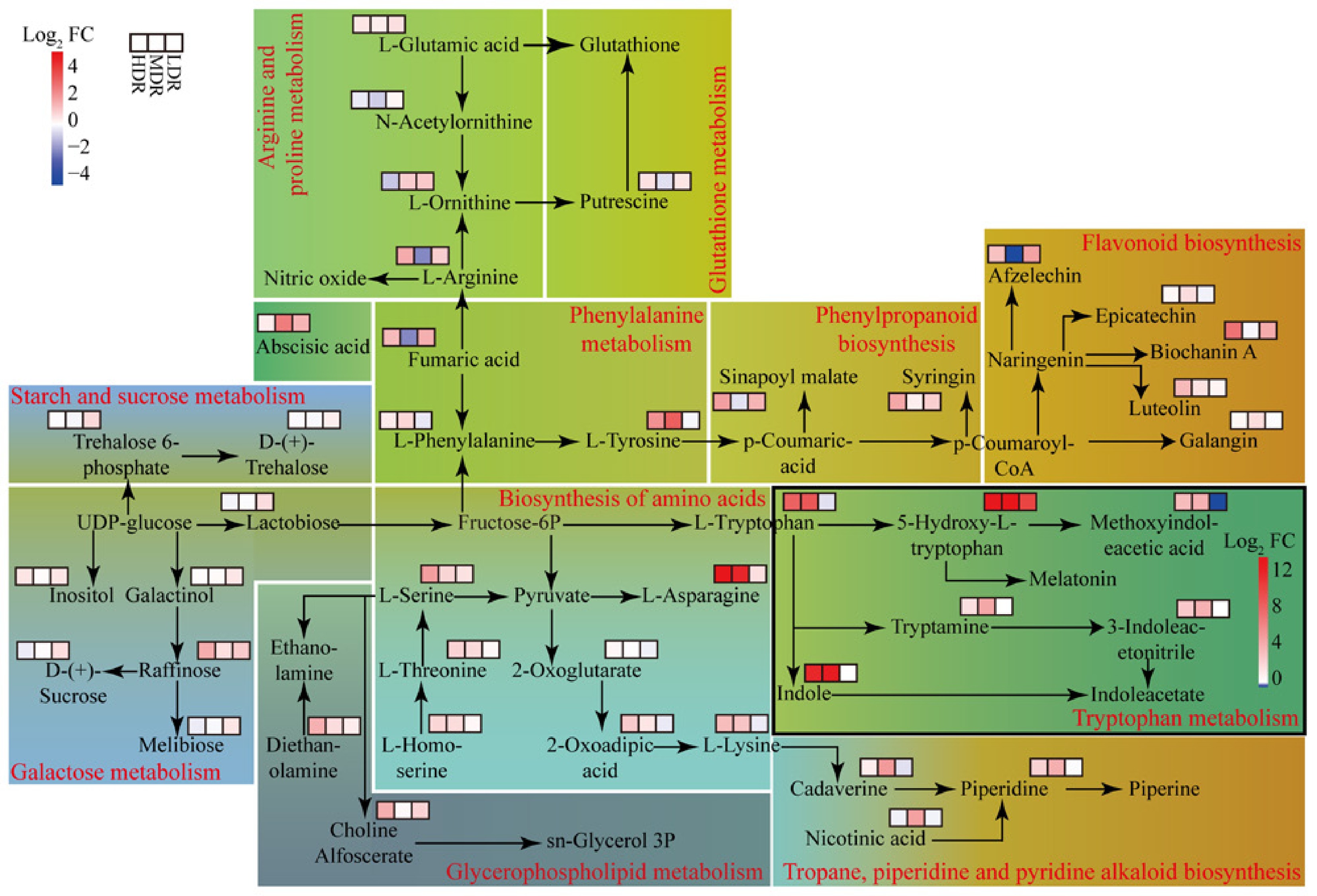
Figure 6.
Metabolic pathways of DEMs in C. lanceolata provenances under drought stress. FC (fold change) represents the ratio of metabolite abundance under drought vs control, and Log2 FC is the log-transformed value. Red indicates higher abundance under drought, while blue indicates lower abundance. Each rectangle represents a metabolic pathway, and the red text along the border indicates the pathway name. Heatmap cells within each pathway show relative changes of individual DEMs across provenances. Cells in black-framed rectangles use a pathway-specific Log2 FC color scale; other rectangles use the color scale shown in the top-left corner. Background colors are used to group pathways with similar physiological functions for visual clarity.
-
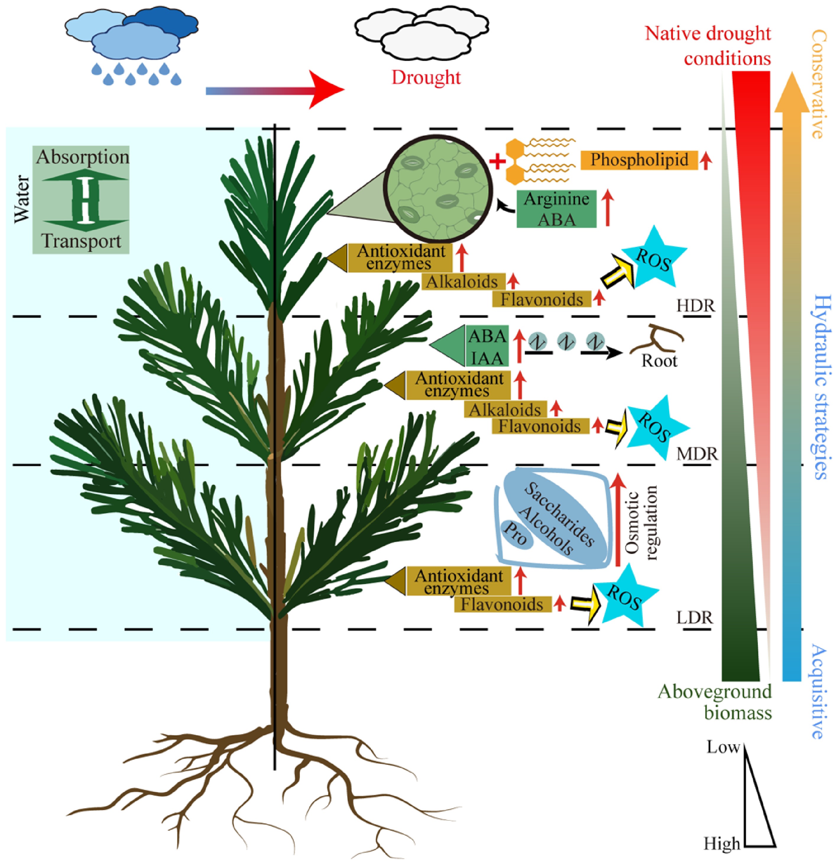
Figure 7.
Schematic representation of drought responses in C. lanceolata from different provenances. Different dashed lines represent different provenances. The red arrows along the text indicate an increase in content, and yellow arrows indicate direction. ABA, Abscisic acid. ROS, Reactive oxygen species. IAA, Auxin. Pro, Proline.
-
Provenance Area Latitude Longitude Altitude (m) MAT (°C) MAP (mm) Dechang Dechang County, Sichuan province, China 27.34 102.19 1,407.13 17.70 1,074.40 Hongya Hongya County, Sichuan province, China 29.70 103.18 1,244.88 16.90 1,362.80 Shiyan Shiyan City, Hubei province, China 32.06 109.97 947.09 15.40 769.60 Data on mean annual temperature (MAT) and mean annual precipitation (MAP) were obtained from local government archives, which compile long-term meteorological records and are widely used in regional studies. Although the archives do not explicitly specify the temporal coverage, these values provide a reliable representation of local climate conditions. Elevation data were obtained from the NASADEM Digital Elevation Model at a 30 m resolution. Table 1.
Environmental characteristics of the three C. lanceolata provenances.
Figures
(7)
Tables
(1)