-
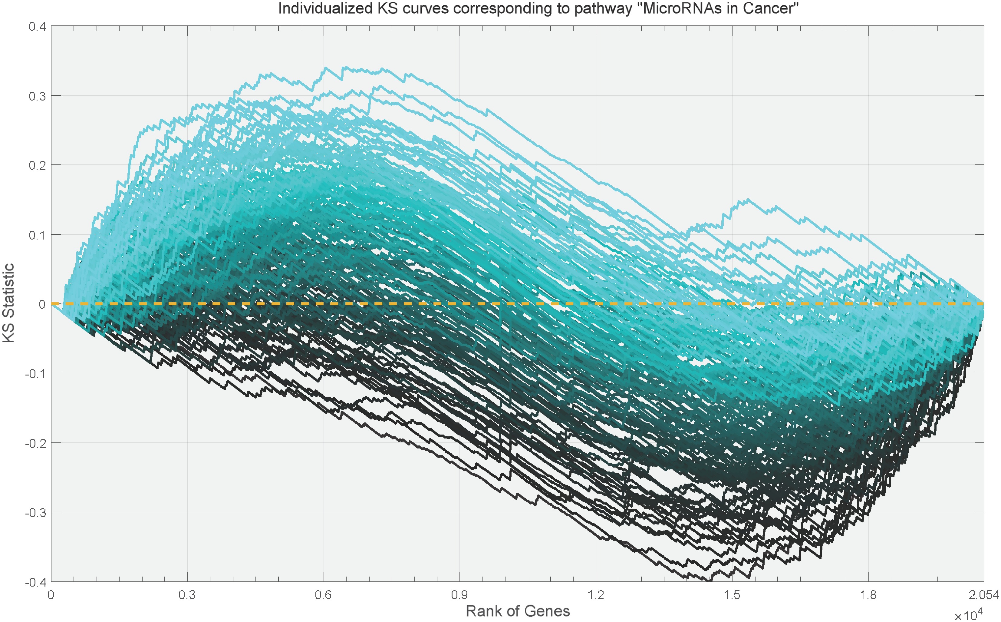
Figure 1.
Individualized KS curves corresponding to the pathway "MicroRNAs in Cancer". Each curve corresponds to an individual and is estimated from the head and neck squamous cell carcinoma data. The depth of the curve's color is determined by the value of the extreme point in the curve.
-
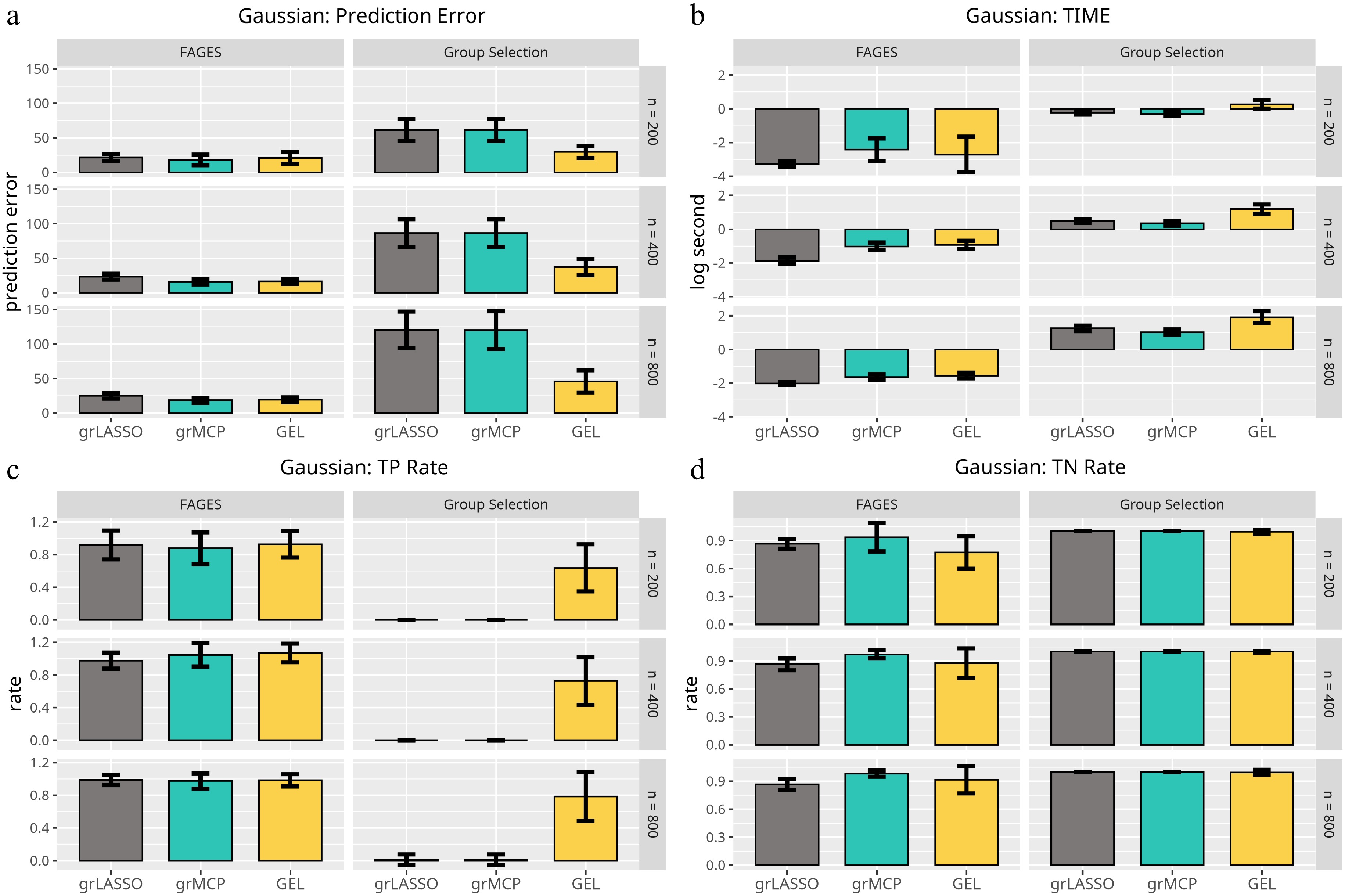
Figure 2.
Results of the linear model with respect to Scenario 1. Each panel represents a different evaluation metric: (a) prediction error, (b) computing time, (c) true negative rate, and (d) true positive rate. The height of each bar indicates the average value of the corresponding metric across multiple simulations, with error bars representing twice the standard deviation. The first three bars in each panel correspond to traditional methods, while the last three bars represent FAGES-based approaches with different penalty settings.
-
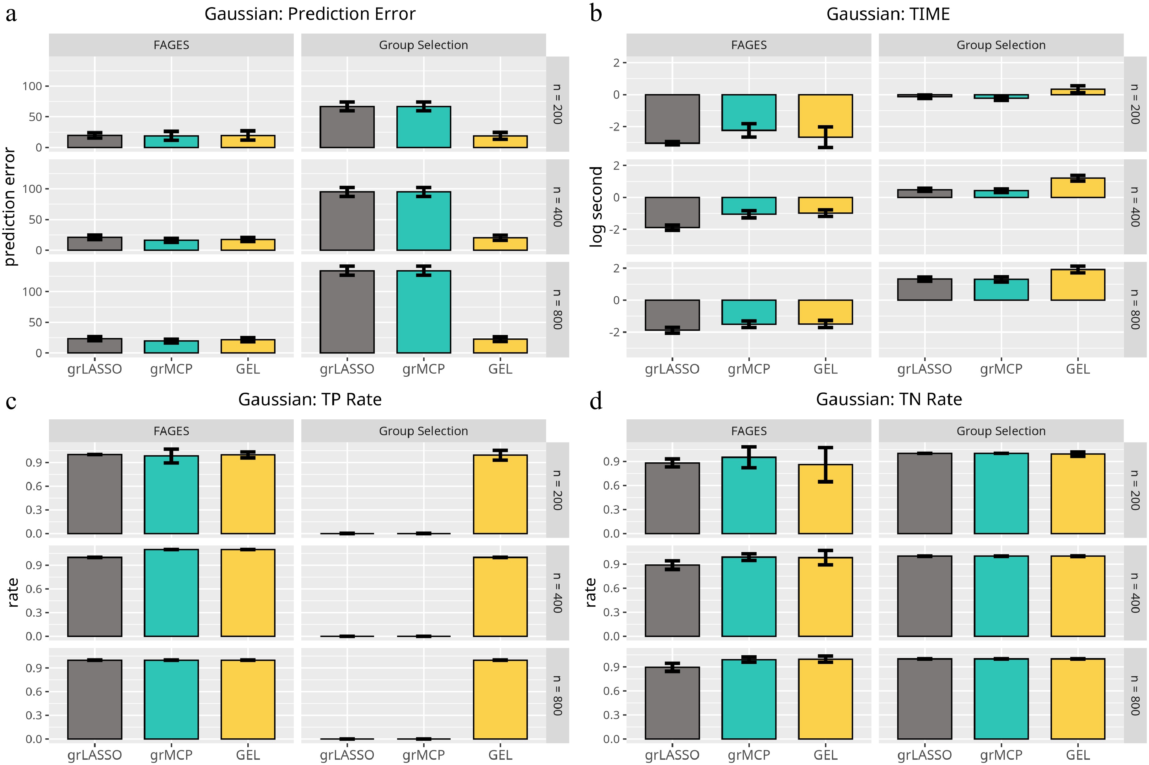
Figure 3.
Results of the linear model with respect to Scenario 2. Each panel represents a different evaluation metric: (a) prediction error, (b) computing time, (c) true positive rate, and (d) true negative rate. The height of each bar indicates the average value of the corresponding metric across multiple simulations, with error bars representing twice the standard deviation. The first three bars in each panel correspond to traditional methods, while the last three bars represent FAGES-based approaches with different penalty settings.
-
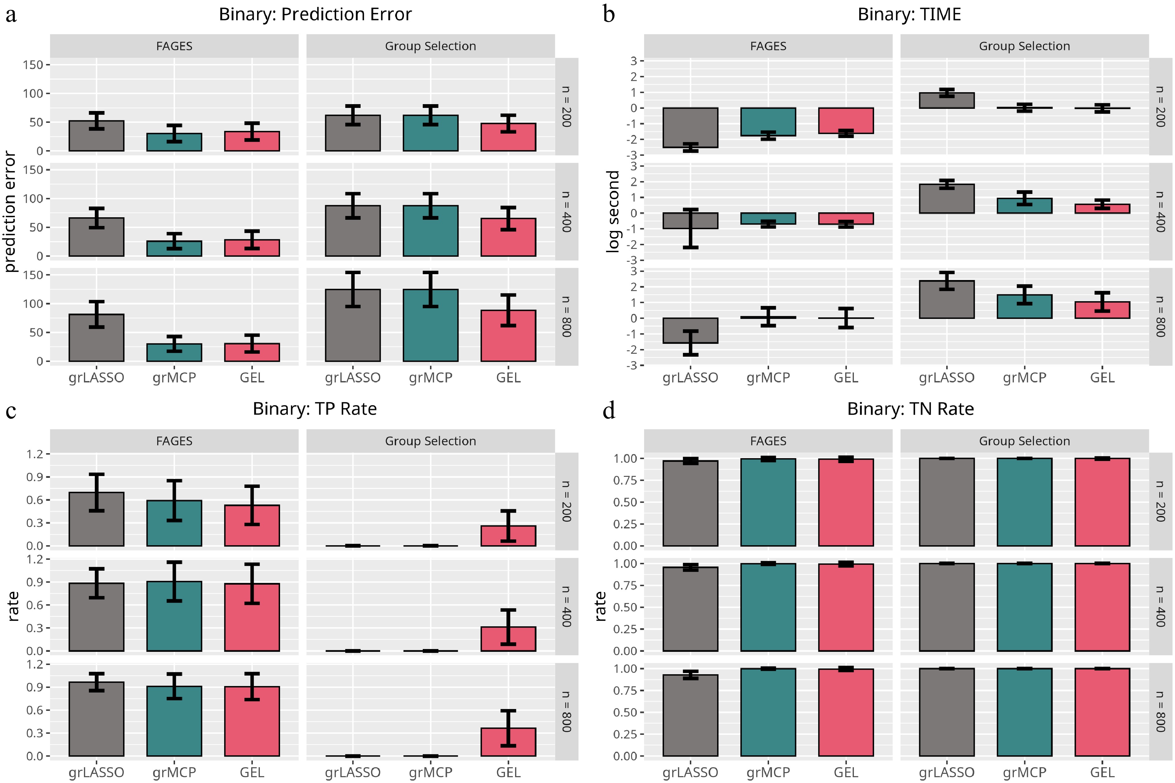
Figure 4.
Results of the logistic model with respect to Scenario 1. Each panel represents a different evaluation metric: (a) prediction error, (b) computing time, (c) true positive rate, and (d) true negative rate. The height of each bar indicates the average value of the corresponding metric across multiple simulations, with error bars representing twice the standard deviation. The first three bars in each panel correspond to traditional methods, while the last three bars represent FAGES-based approaches with different penalty settings.
-
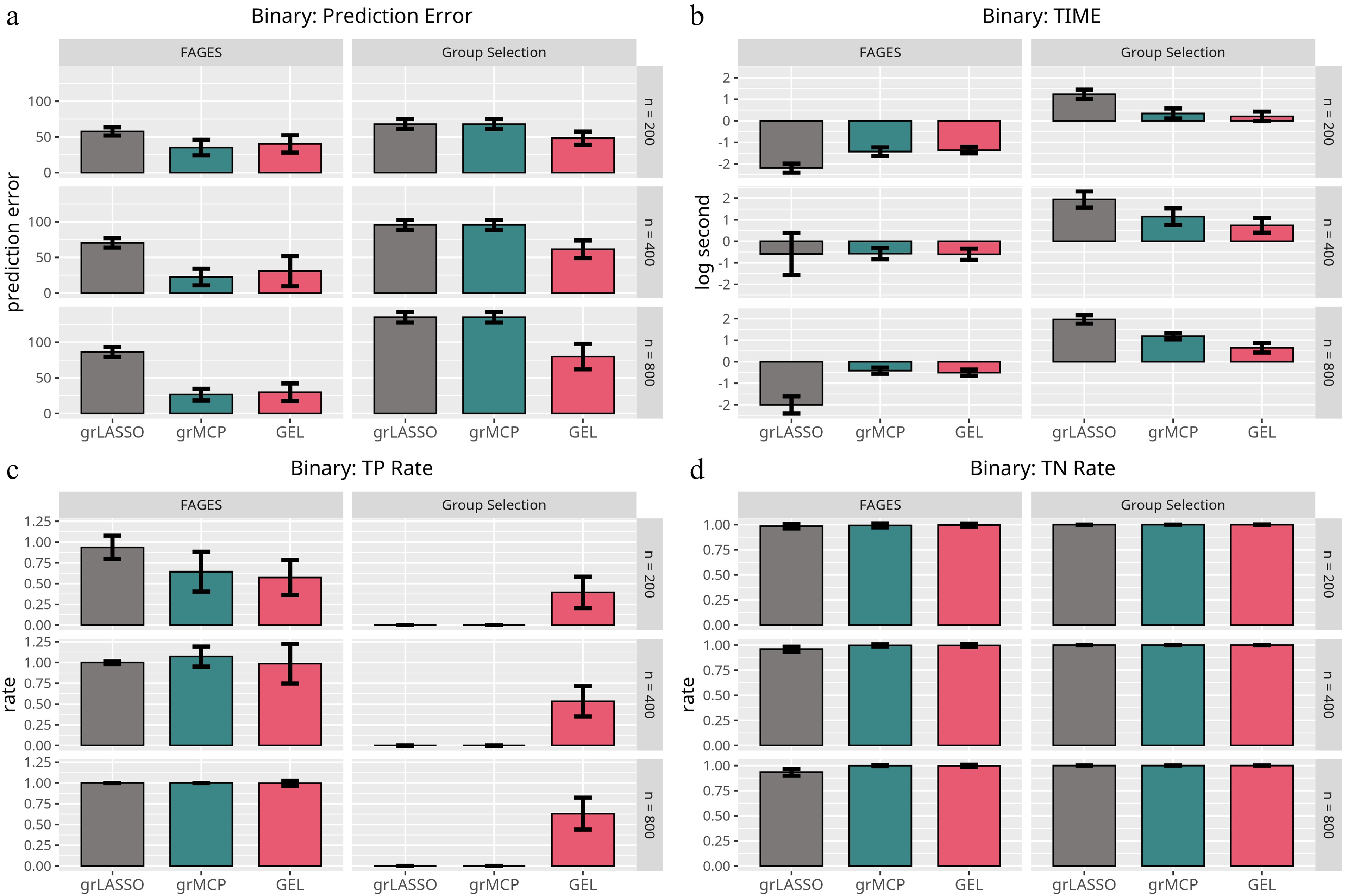
Figure 5.
Results of the logistic model with respect to Scenario 2. Each panel represents a different evaluation metric: (a) prediction error, (b) computing time, (c) true negative rate, and (d) true positive rate. The height of each bar indicates the average value of the corresponding metric across multiple simulations, with error bars representing twice the standard deviation. The first three bars in each panel correspond to traditional methods, while the last three bars represent FAGES-based approaches with different penalty settings.
-
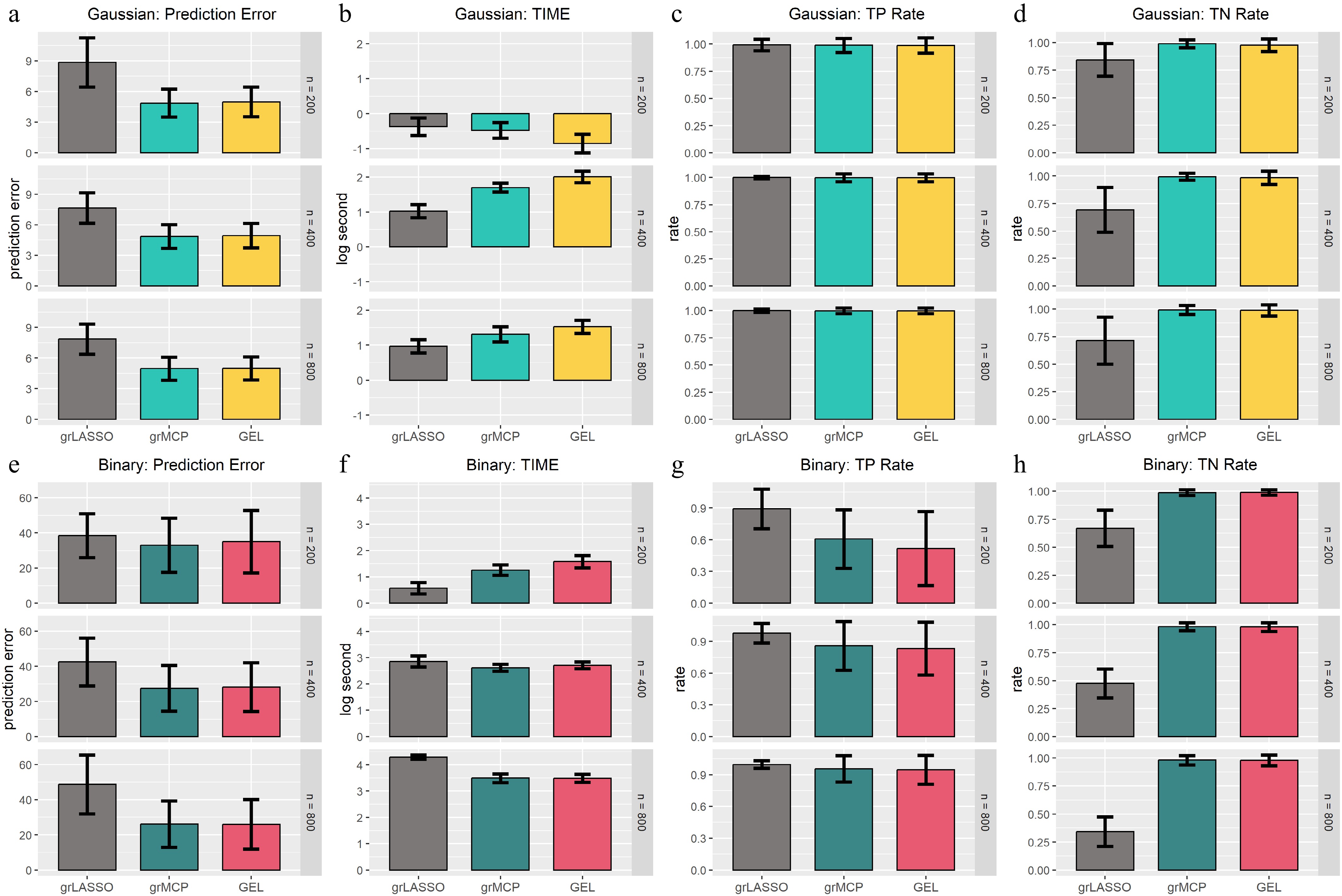
Figure 6.
Results of functional data analysis. The first four rows correspond to the Gaussian model, while the last four rows correspond to the binary model. Each column represents a different evaluation metric: (a), (e) prediction error; (b), (f) computing time; (c), (g) true negative rate; and (d), (h) true positive rate. The height of each bar indicates the average value of the corresponding metric across multiple simulations, with error bars representing twice the standard deviation. Different methods are compared, with the first set of bars corresponding to traditional approaches and the latter set representing FAGES-based methods with different penalty settings.
-
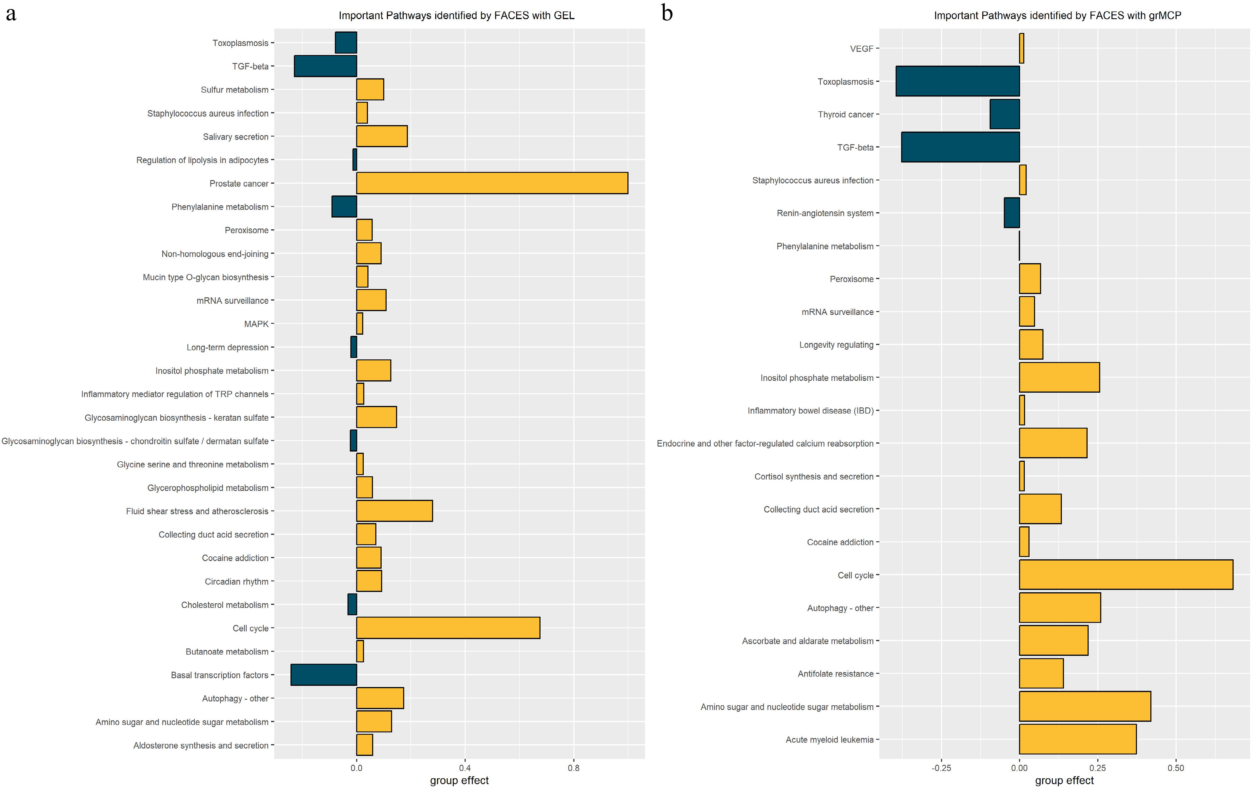
Figure 7.
Important pathways identified by FAGES with different penalty functions. (a) shows the results obtained using GEL, while (b) displays the results yielded by grMCP. The bars represent the estimated averaged group effect for each selected pathway, with the pathway names shown on the y-axis. Green bars indicate pathways that are positively associated with the outcome, while yellow bars indicate pathways that are negatively associated with the outcome.
Figures
(7)
Tables
(0)