-
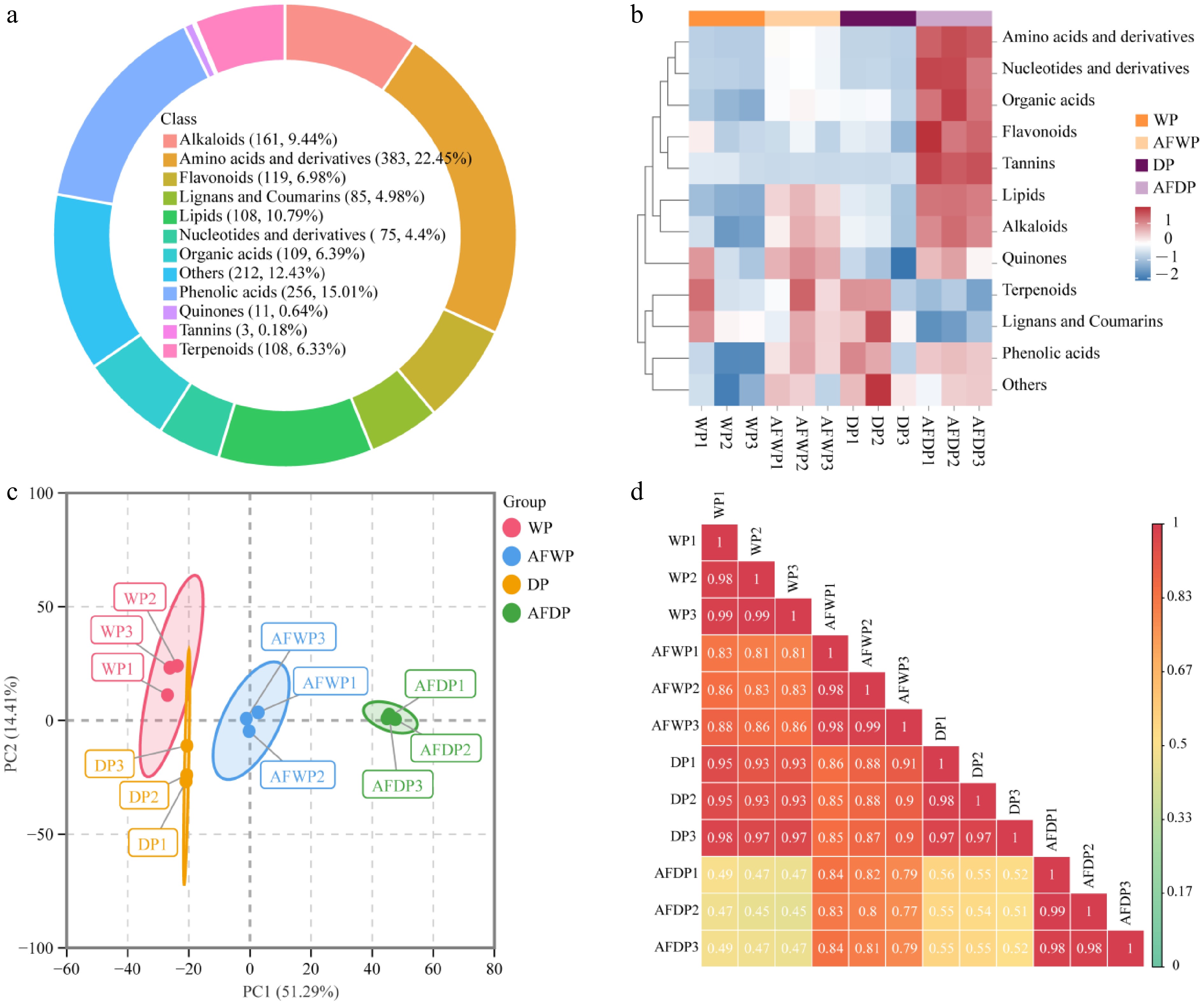
Figure 1.
Metabolome profile of coffee processed with four different methods. (a) Circle diagram of metabolite classification. (b) Heatmap of sum of relative metabolite intensities of compounds in each class. (c) Principal component analysis. (d) Pearson's correlation coefficient analysis.
-
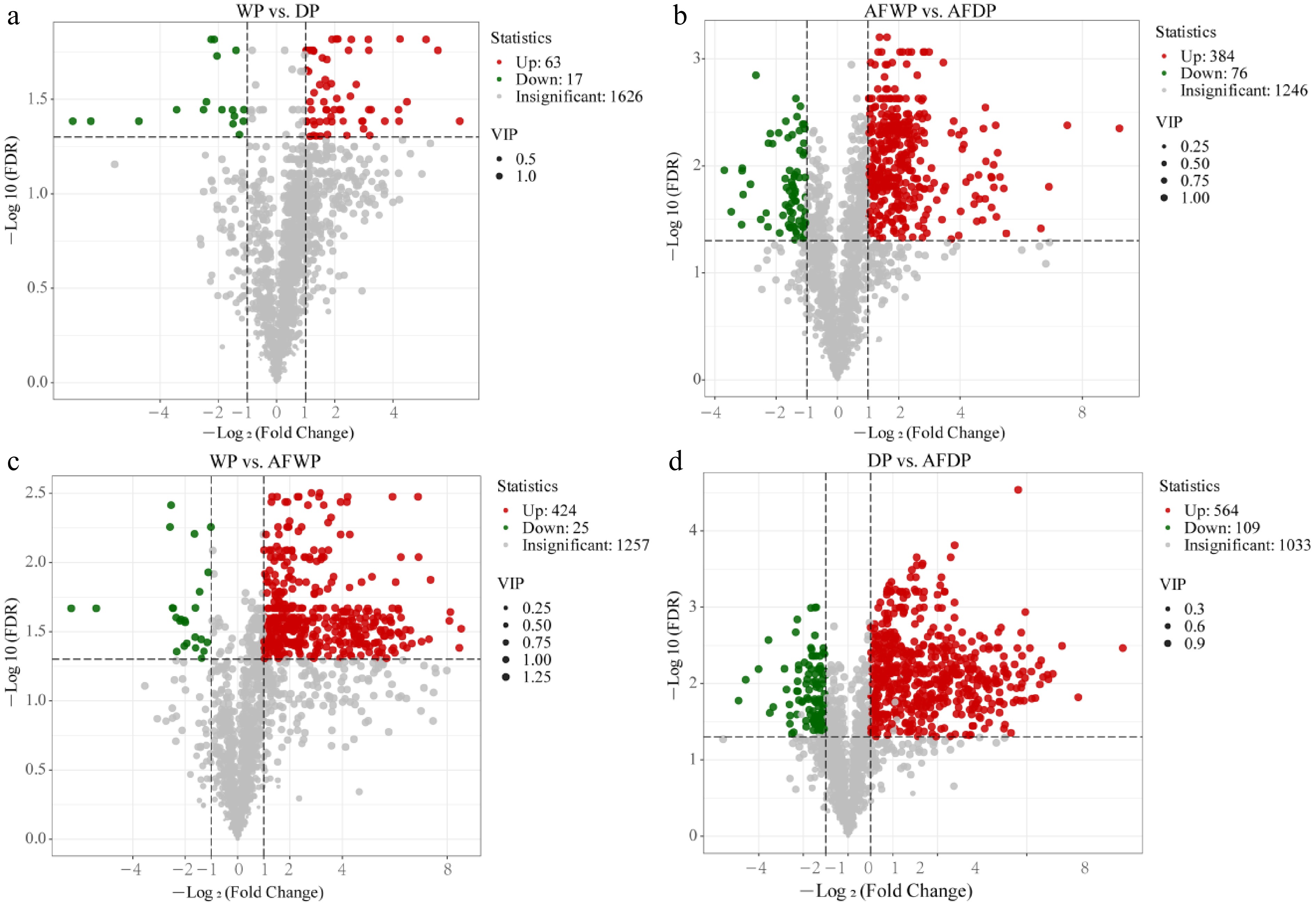
Figure 2.
Volcano plot of differential metabolites for different processing methods. (a) WP vs DP; (b) AFWP vs AFDP; (c) WP vs AFWP; (d) DP vs AFDP.
-
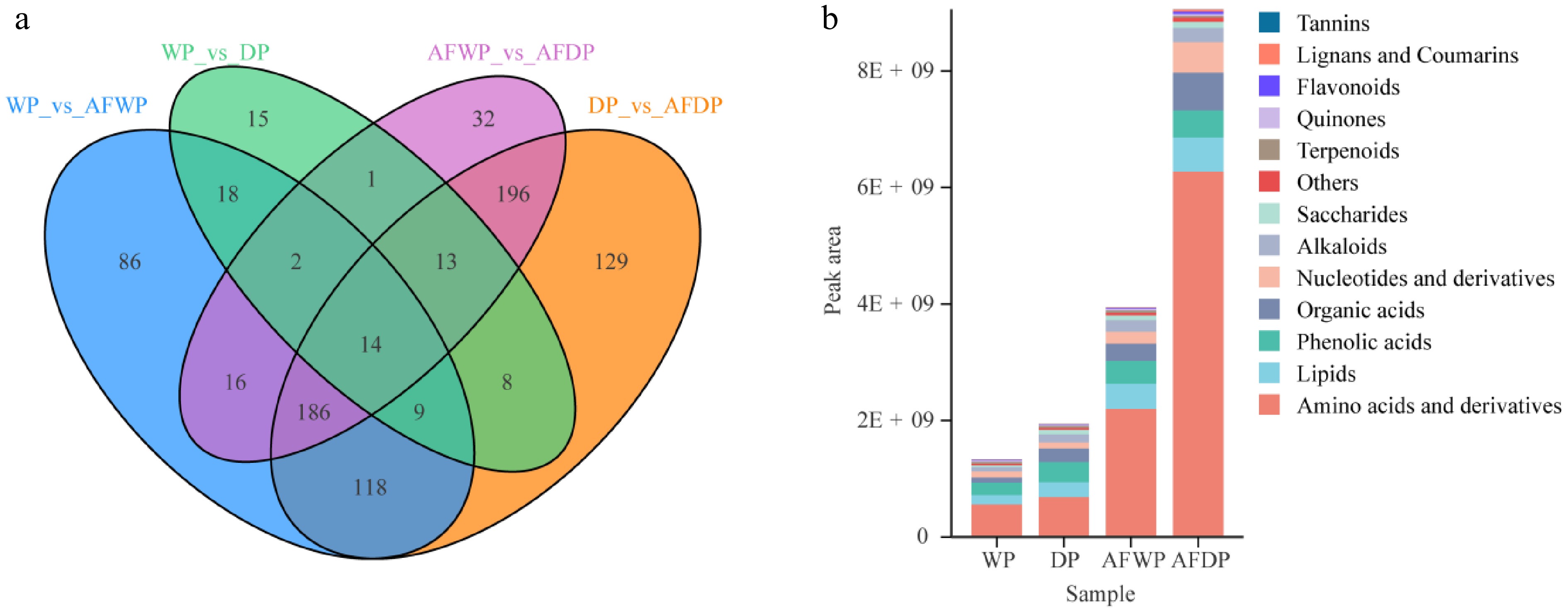
Figure 3.
(a) Venn diagram of differential metabolites for each comparison group; (b) histogram of relative content of differential metabolites.
-
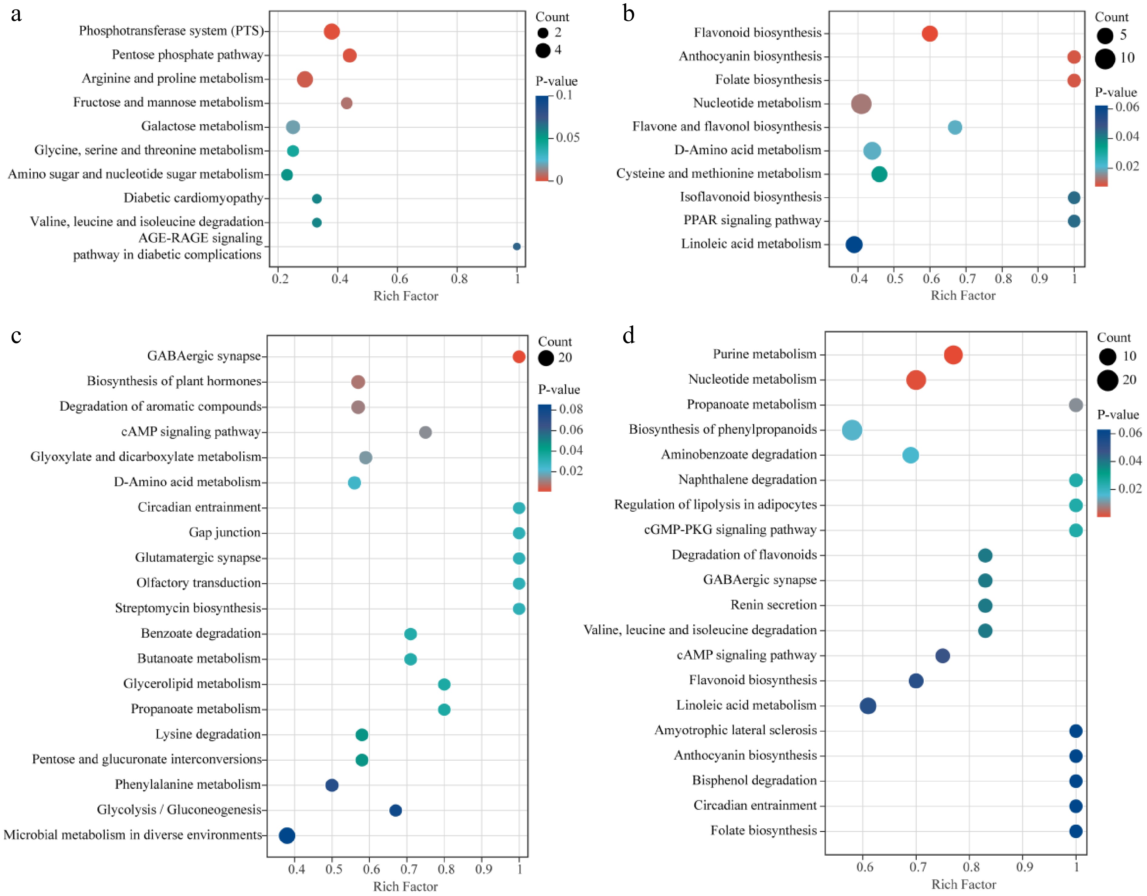
Figure 4.
KEGG enrichment analysis of differential metabolites. (a) WP vs DP; (b) AFWP vs AFDP; (c) WP vs AFWP; (d) DP vs AFDP.
-
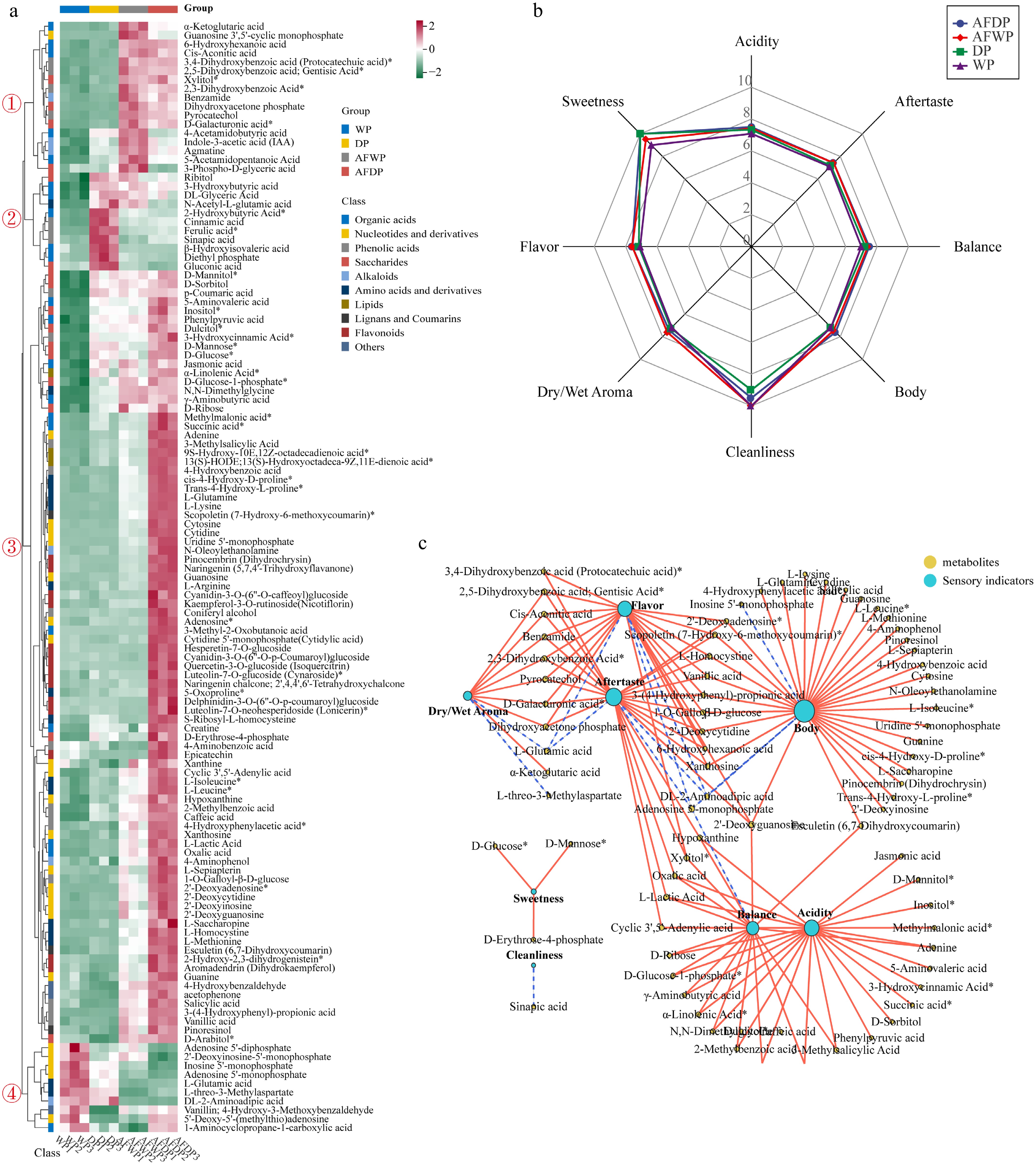
Figure 5.
(a) Hierarchical clustering analysis of characteristic metabolites and different processing methods, four clusters were generated, the relative content of metabolites were shown from green (low) to red (high) and data were Z-score standardized; (b) scores of cup test by Q-graded coffee panelists; (c) sensory indicators-characteristic metabolites interaction network analysis, the correlation coefficients were calculated using Pearson's test (r2 > 0.9, p < 0.05), the solid red line represented a positive correlation, the dashed blue line represented a negative correlation.
Figures
(5)
Tables
(0)