-
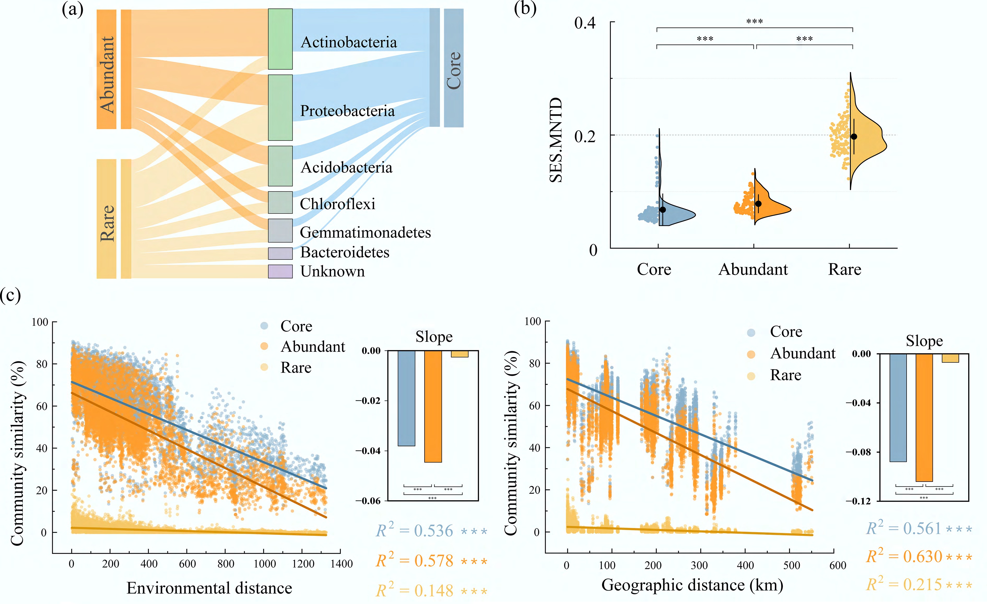
Figure 1.
Taxonomic composition and phylogenetic patterns of core, abundant, and rare subcommunities. (a) Distribution of different subcommunities (core, abundant, rare) at the phylum level, with band thickness representing the number of subcommunities assigned to each phylum. (b) Boxplots showing the distribution of SES.MNTD values for different subcommunities. (c) Phylogenetic distance-decay curves illustrating changes in community similarity (1–βMNTD) of different subcommunities with increasing geographical and environmental distances. Asterisks denote significance levels (*** p < 0.001; Wilcoxon rank-sum test).
-
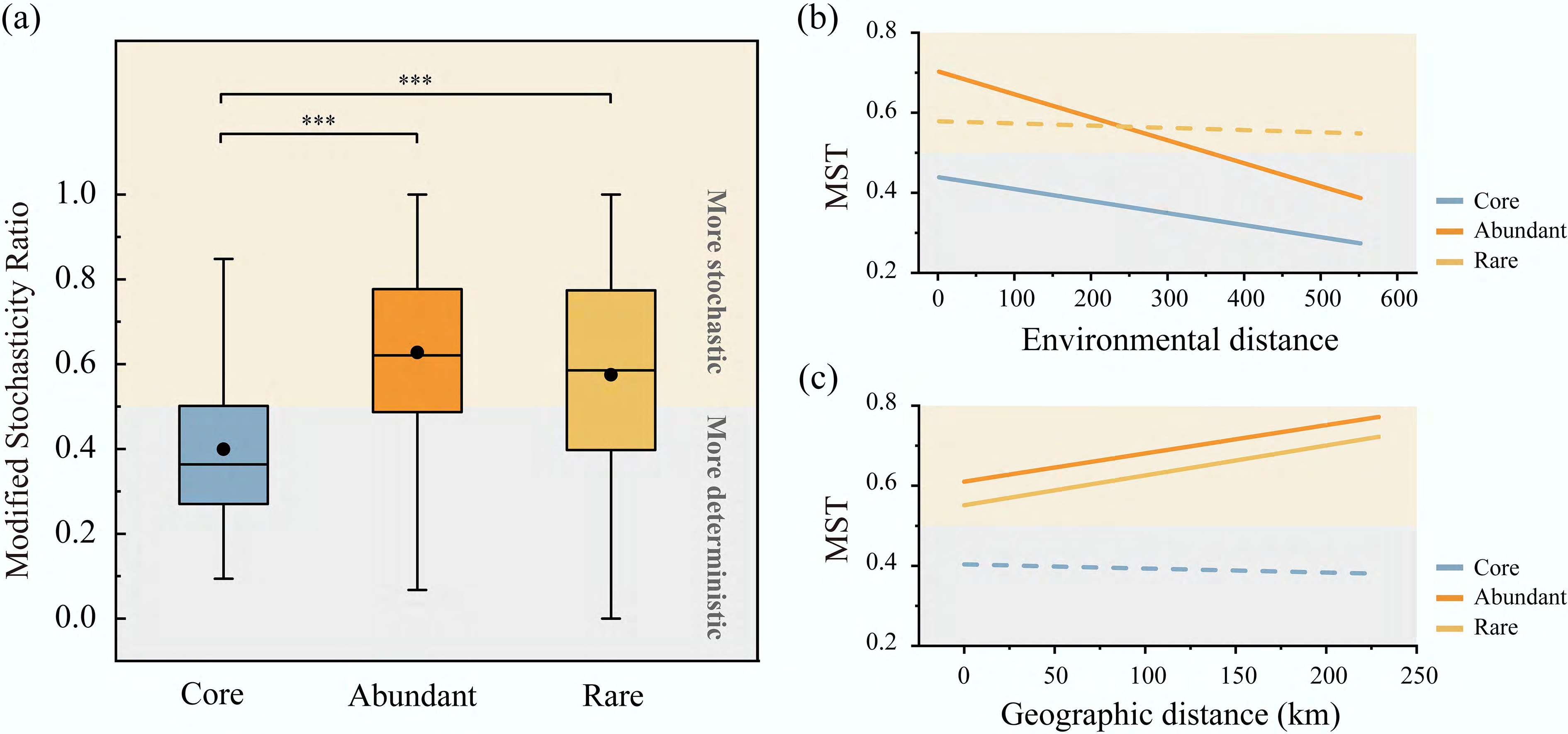
Figure 2.
MST ratios and their relationships with environmental and geographical distances for core, abundant, and rare subcommunities. (a) Modified stochasticity ratio (MST) of different bacterial subcommunities is presented, with black dots representing the mean values. The MST index has a threshold of 50%, distinguishing between more deterministic (< 50%) and more stochastic (> 50%) assembly processes. *** p < 0.001 (Wilcoxon rank-sum test). (b), (c) Trends in MST ratios with environmental and geographical distances. Solid lines indicate significant relationships (p < 0.05), whereas dashed lines represent non-significant relationships (p ≥ 0.05).
-
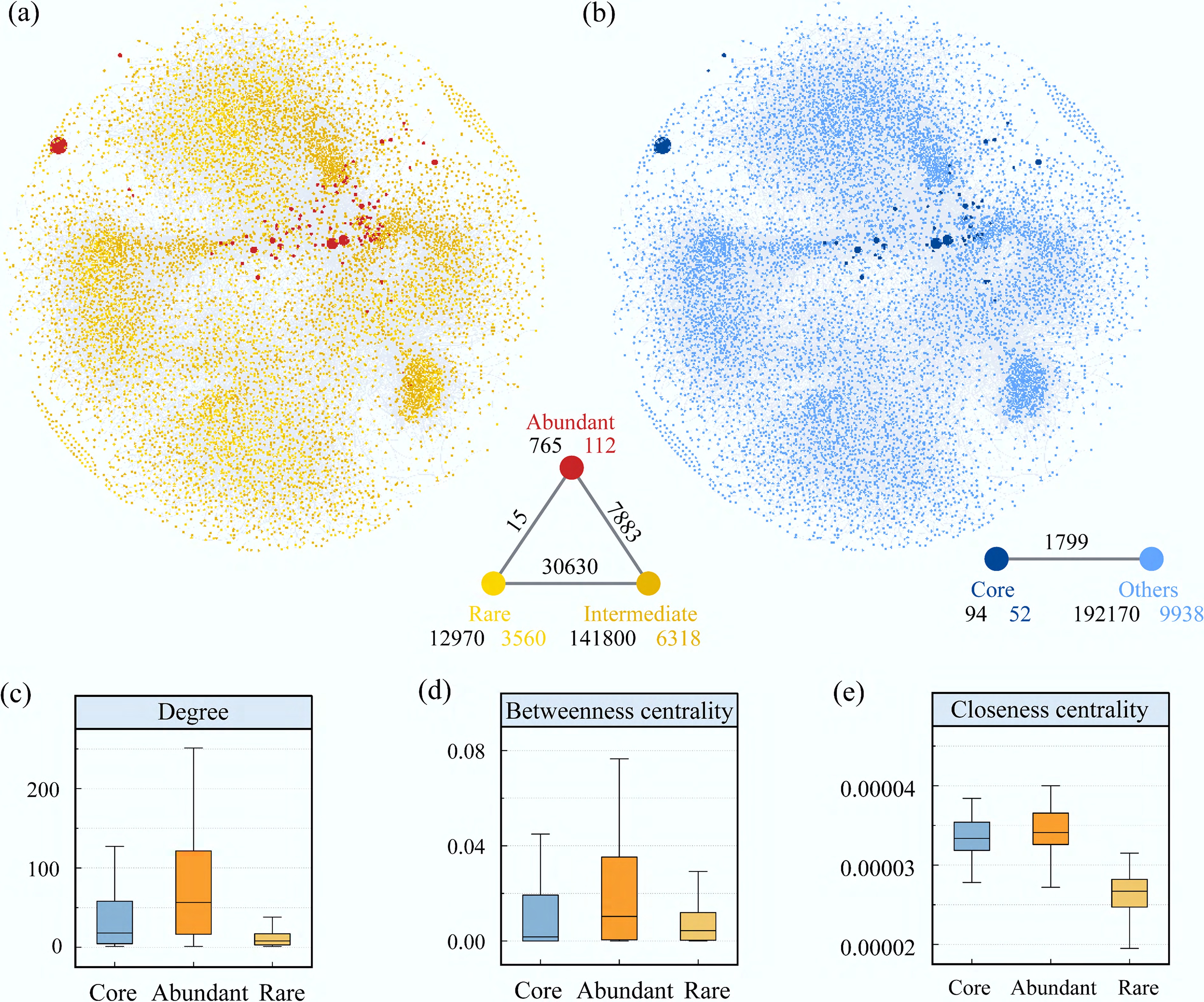
Figure 3.
Co-occurrence patterns and ecological niche properties of different bacterial subcommunities based on correlation analysis. (a) Co-occurrence network of abundant (red nodes), intermediate (yellow nodes), and rare (light yellow nodes) subcommunities. Node size represents taxon abundance, and lines indicate co-occurrence relationships between subcommunities. The triangular plot below shows the number and strength of connections among different subcommunity groups. (b) Co-occurrence network of core and other subcommunities. Node size represents taxon abundance. The lines below indicate the number and strength of connections between core and other subcommunities. (c)–(e) Distributions of degree, betweenness centrality, and closeness centrality for core, abundant, and rare subcommunities.
-
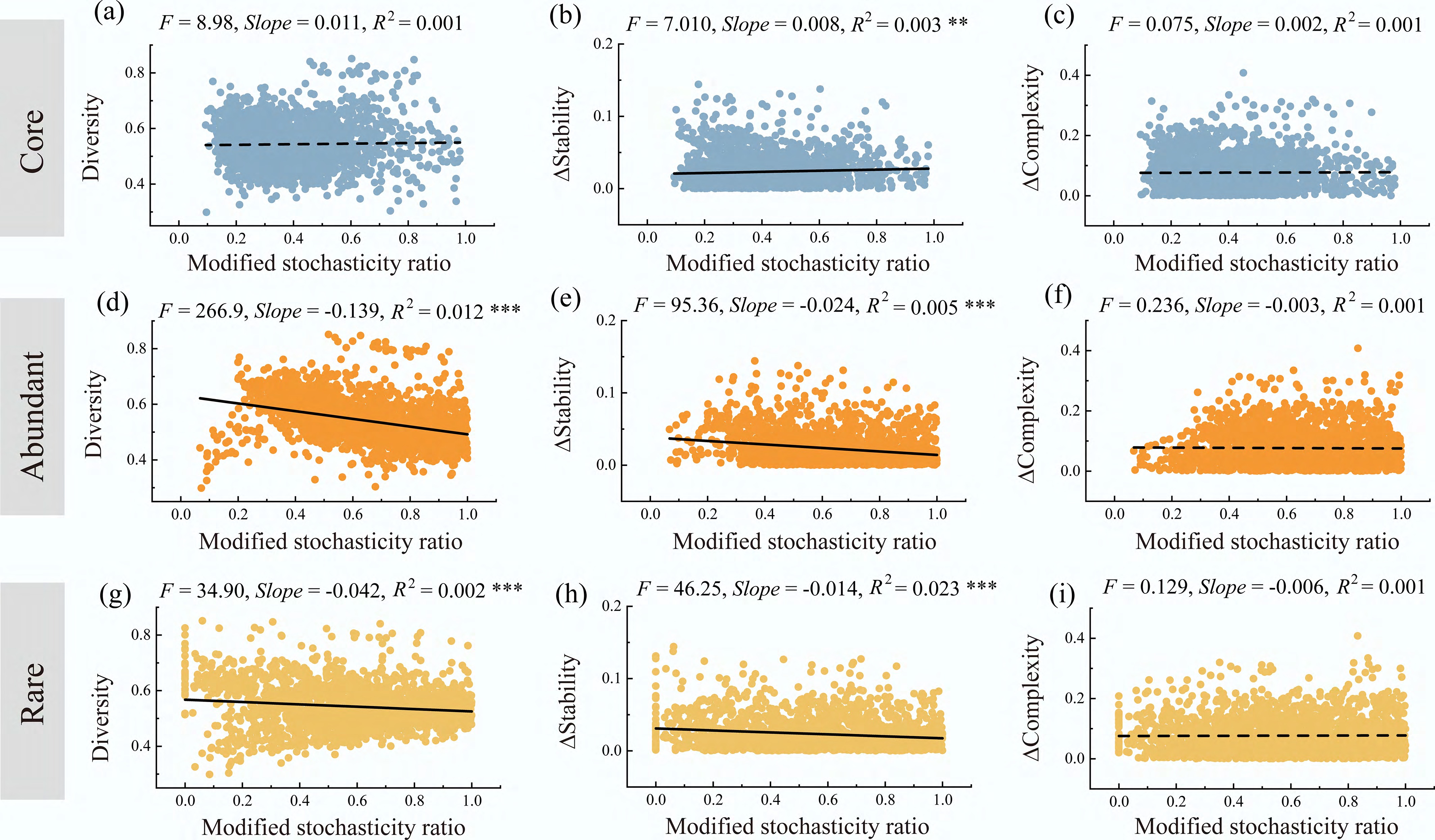
Figure 4.
Relationships between the assembly processes of different bacterial subcommunities and community diversity, stability, and complexity. Relationships between the assembly processes of core subcommunities and (a) community β-diversity, (b) community stability, and (c) community complexity. Relationships between the assembly processes of abundant subcommunities and (d) community β-diversity, (e) community stability, and (f) community complexity. Relationships between the assembly processes of rare subcommunities and (g) community β-diversity, (h) community stability, and (i) community complexity. Each panel displays the linear regression model (black line) and the corresponding correlation coefficient. ** p < 0.01; *** p < 0.001.
-
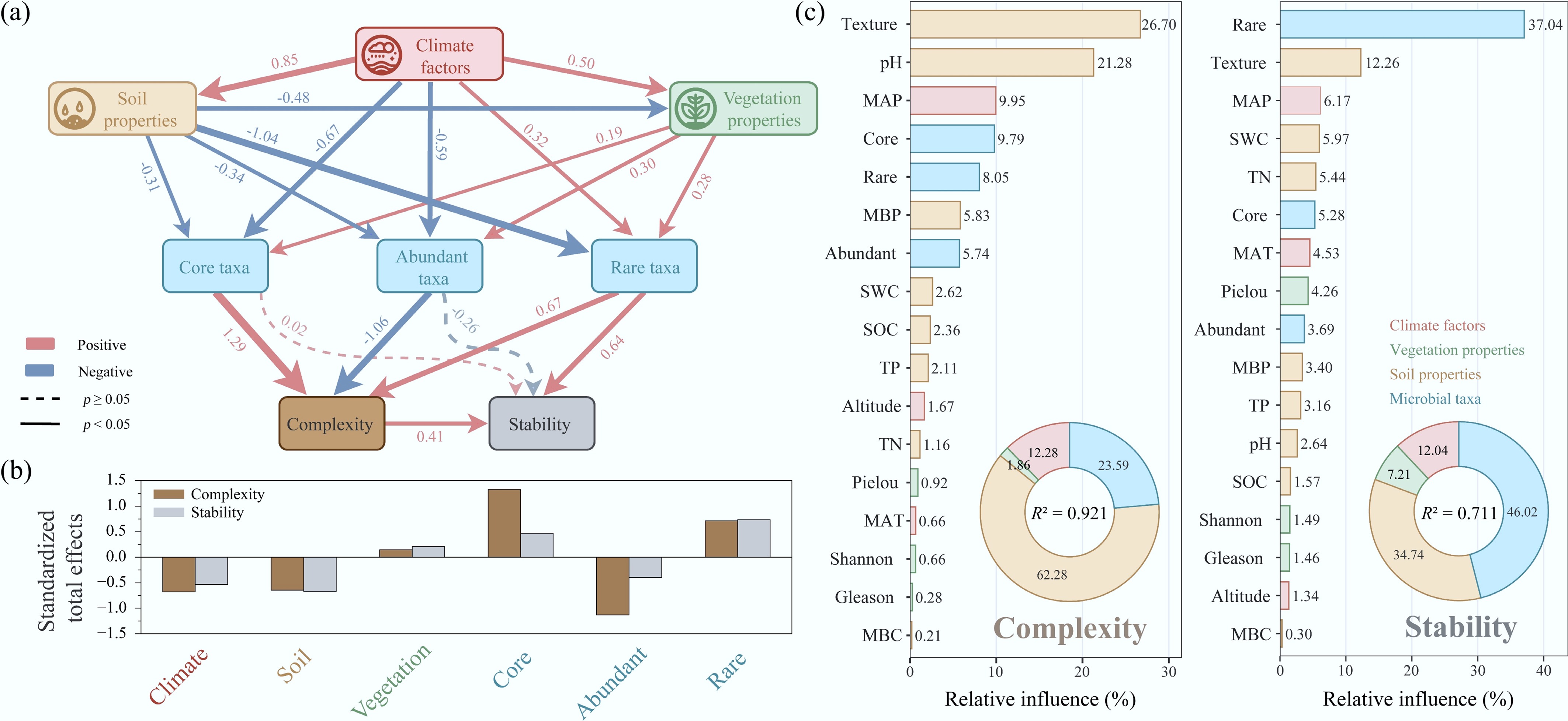
Figure 5.
Relative importance and pathway relationships of environmental factors and microbial taxa in shaping bacterial community complexity and stability. (a) Partial least squares path model showing the direct and indirect effects of climate factors, soil properties, and vegetation properties on core, abundant, and rare taxa, as well as their subsequent effects on community complexity and stability. Red arrows indicate positive correlations, while blue arrows indicate negative correlations. Solid lines represent significant relationships (p < 0.05), and dashed lines represent non-significant relationships (p ≥ 0.05). Numbers on the arrows are standardized path coefficients, reflecting the relative influence of each factor on the response variables. (b) Standardized total effects of major environmental factors and taxonomic characteristics on community complexity and stability. Dark green bars represent effects on complexity, and light green bars represent effects on stability, indicating the relative impact of environmental factors and taxonomic characteristics on community complexity and stability. (c) Boosted regression tree analysis showing the relative influence of individual predictors on community complexity and stability. The inset donut charts show the grouped contribution of four predictor types, and the values in the center indicate model explanatory power (R2).
Figures
(5)
Tables
(0)