-
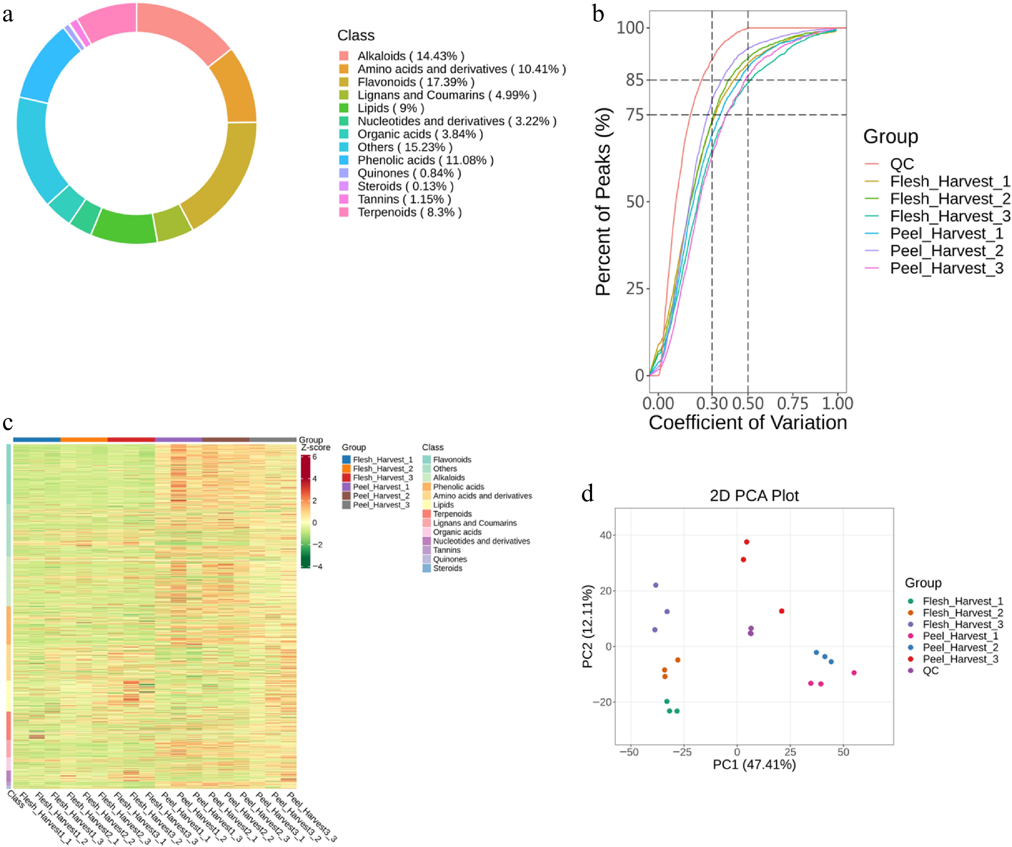
Figure 1.
(a) Ring plot of metabolite categories. (b) CV distribution of each group. (c) Hierarchical Cluster Analysis (HCA). (d) PCA score diagram of quality spectrum data of each group of samples and quality control samples.
-
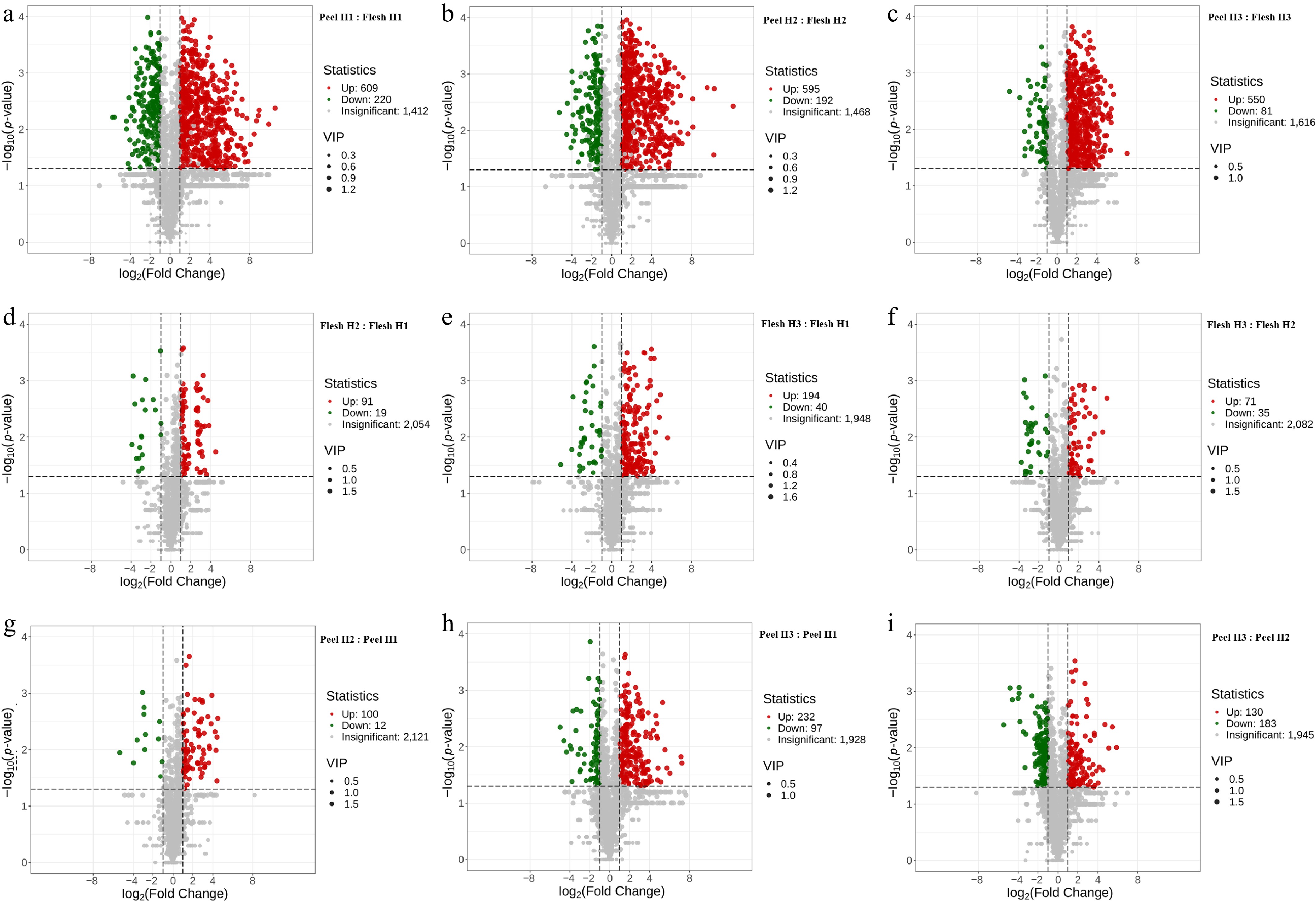
Figure 2.
Volcano plot of differential metabolites for (a) peel H1 : flesh H1, (b) peel H2 : flesh H2, (c) peel H3 : flesh H3, (d) flesh H2 : flesh H1, (e) flesh H3 : flesh H1, (f) flesh H3 : flesh H2, (g) peel H2 : peel H1, (h) peel H3 : peel H1, and (i) peel H3 : peel H2. Each point in the volcano plot represents a metabolite, with green dots representing downregulated differential metabolites, red dots representing upregulated differential metabolites, and gray dots representing the detected metabolites but showing no significant differences. The X-axis represents the Log2FC value of metabolites between two groups. The further away from 0 on the X-axis, the greater the fold-change between two groups. If the metabolites were screened using VIP + FC + p-value, the Y-axis will represent the level of significant differences (−Log10 p-value). The size of each dot represents the VIP value. If the metabolites were screened using VIP + FC, the Y-axis will represent the VIP value. The larger the VIP value, the more significant the difference and the more reliable the screening process.
-
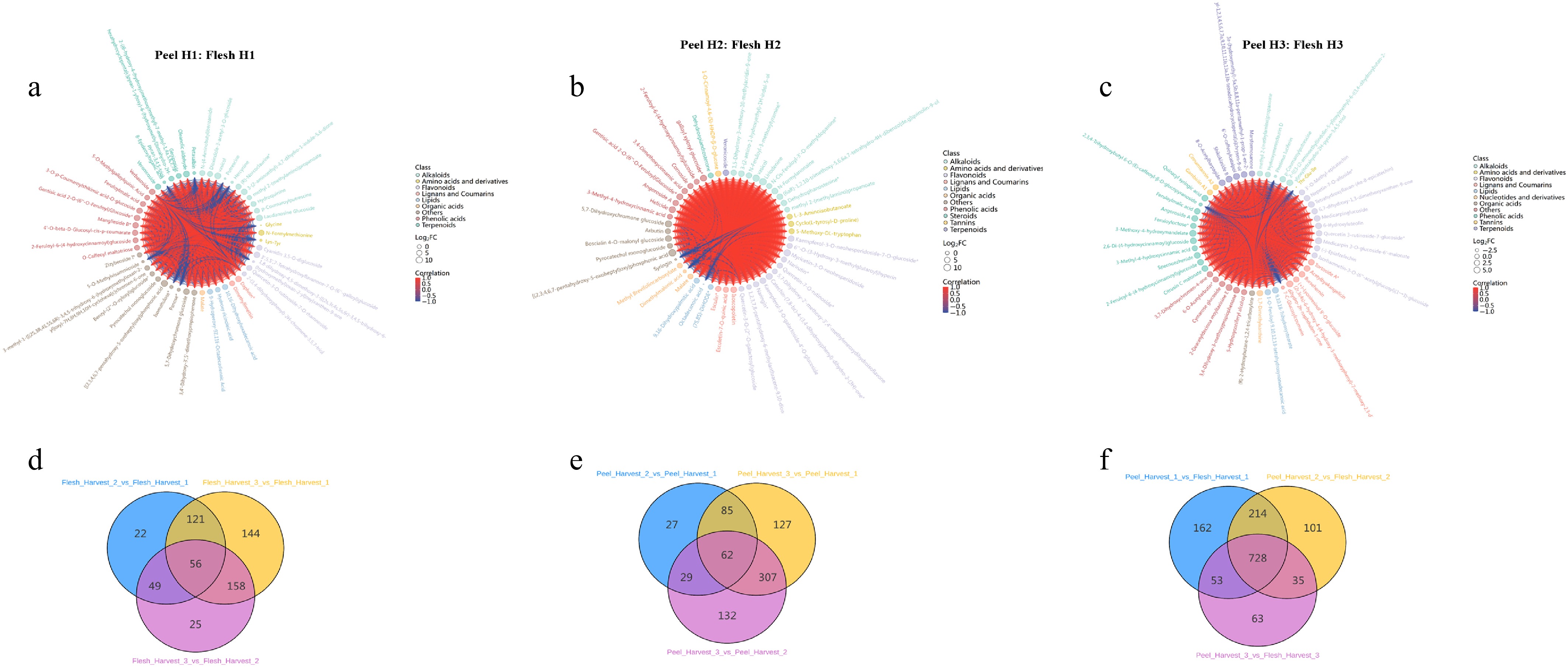
Figure 3.
Chord diagram of differential metabolites for (a) peel H1 : flesh H1, (b) peel H2 : flesh H2, and (c) peel H3 : flesh H3. The outermost layer shows the metabolite ID, and the second layer shows the Log2FC value; the larger the dot, the larger the Log2FC value. The color for the first and second layers represents Class I metabolite classification. The chords in the innermost layer reflect the Pearson correlation between the connected metabolites. Red chords represent positive correlation, and blue chords represent negative correlation. If there are more than 50 differential metabolites, the figure will only show the top 50 metabolites based on VIP. (d)–(f) represent Venn diagrams of differences among groups for peel and flesh. Each circle represents a comparison group; the number in overlapped parts represents the number of common differential metabolites between comparison groups, and the number in non-overlapped parts represents the number of unique differential metabolites in comparison groups.
-
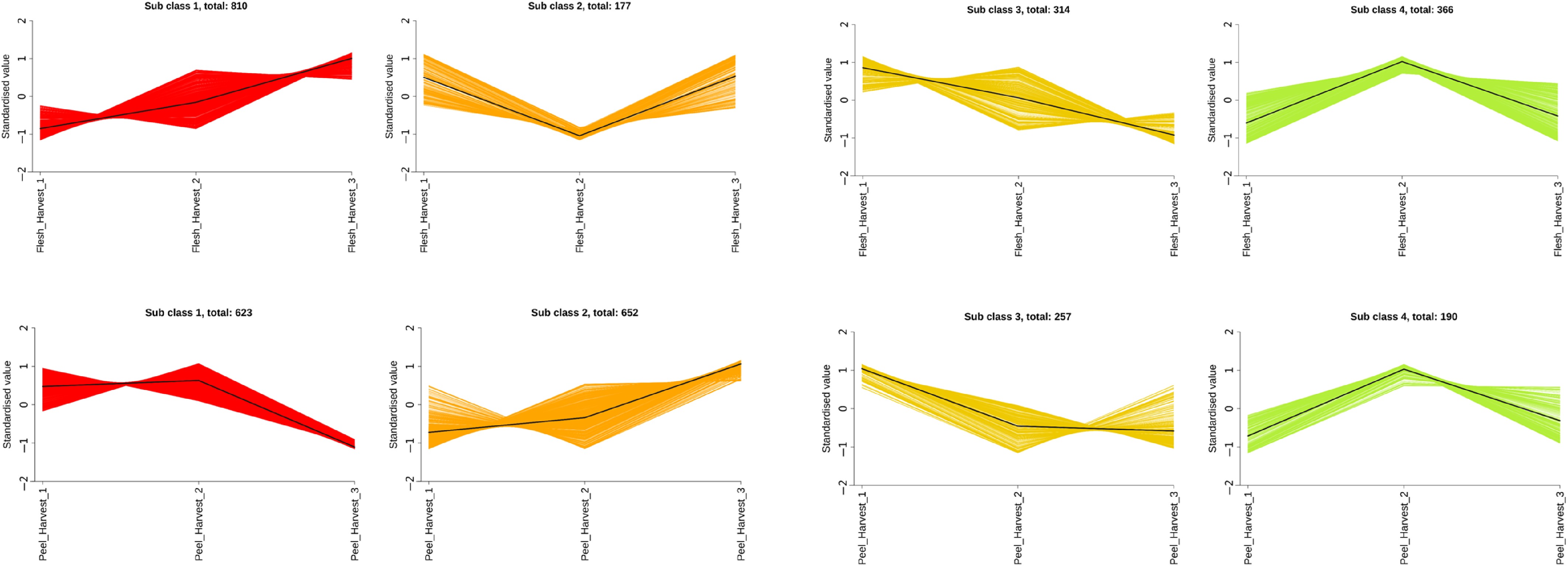
Figure 4.
K-means diagram of differential metabolites. The X-axis represents the sample names, and the Y-axis represents the normalized relative quantification. 'Sub class' represents a group of metabolites with the same trend, and 'total' represents the number of metabolites in this cluster.
-
Flesh firmness (N) Dry matter content (%) IAD value L* a* b* Harvest 1 3.4 a 25.9 a 2.24 a 60.7 a −13.2 c 35.3 a 2 1.8 b 24.7 b 2.19 a 60.0 a −11.8 b 35.1 a 3 1.1 c 24.0 b 1.88 b 54.2 b −7.3 a 31.5 b p-value < 0.0001 0.0002 < 0.0001 < 0.0001 < 0.0001 < 0.0001 Fruit side Sunny 1.8 b 22.4 b 2.09 57.4 b −7.6 a 34.2 Shaded 2.4 a 27.4 a 2.11 59.2 a −13.9 b 33.7 p-value 0.0023 < 0.0001 0.3963 0.004 < 0.0001 0.4086 Different letters in the same column indicate significant differences at p value < 0.05 (in bold). Table 1.
Fruit maturity of 'Shenandoah™' at harvest, including measurements of flesh firmness, dry matter content, IAD value, L*, a*, and b* from sunny and shaded sides for fruit harvested in three harvests at weekly intervals in 2024.
Figures
(4)
Tables
(1)