-
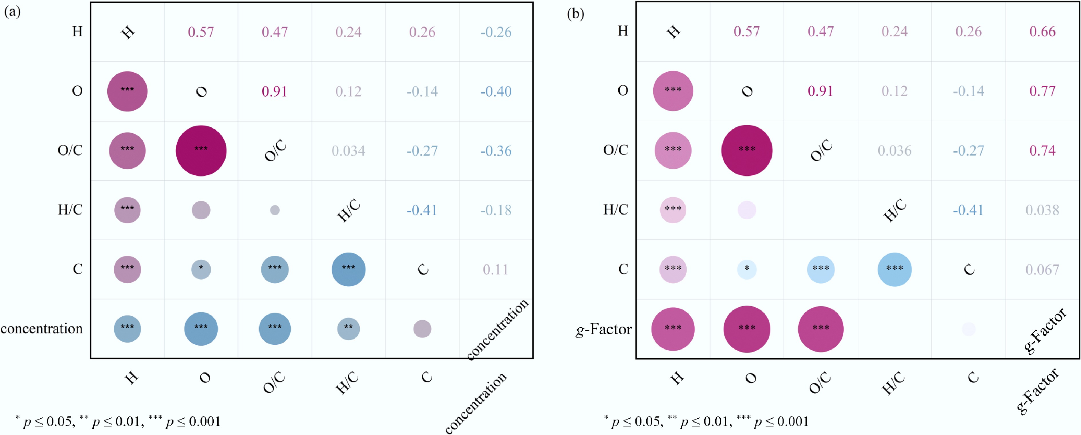
Figure 1.
Pairwise Pearson correlation matrix of all variables—H, O, O/C, H/C, and C: (a) Pearson correlation matrix between PFRs concentration and the variables. (b) Pearson correlation matrix between PFRs g-Factor value and the variables.
-
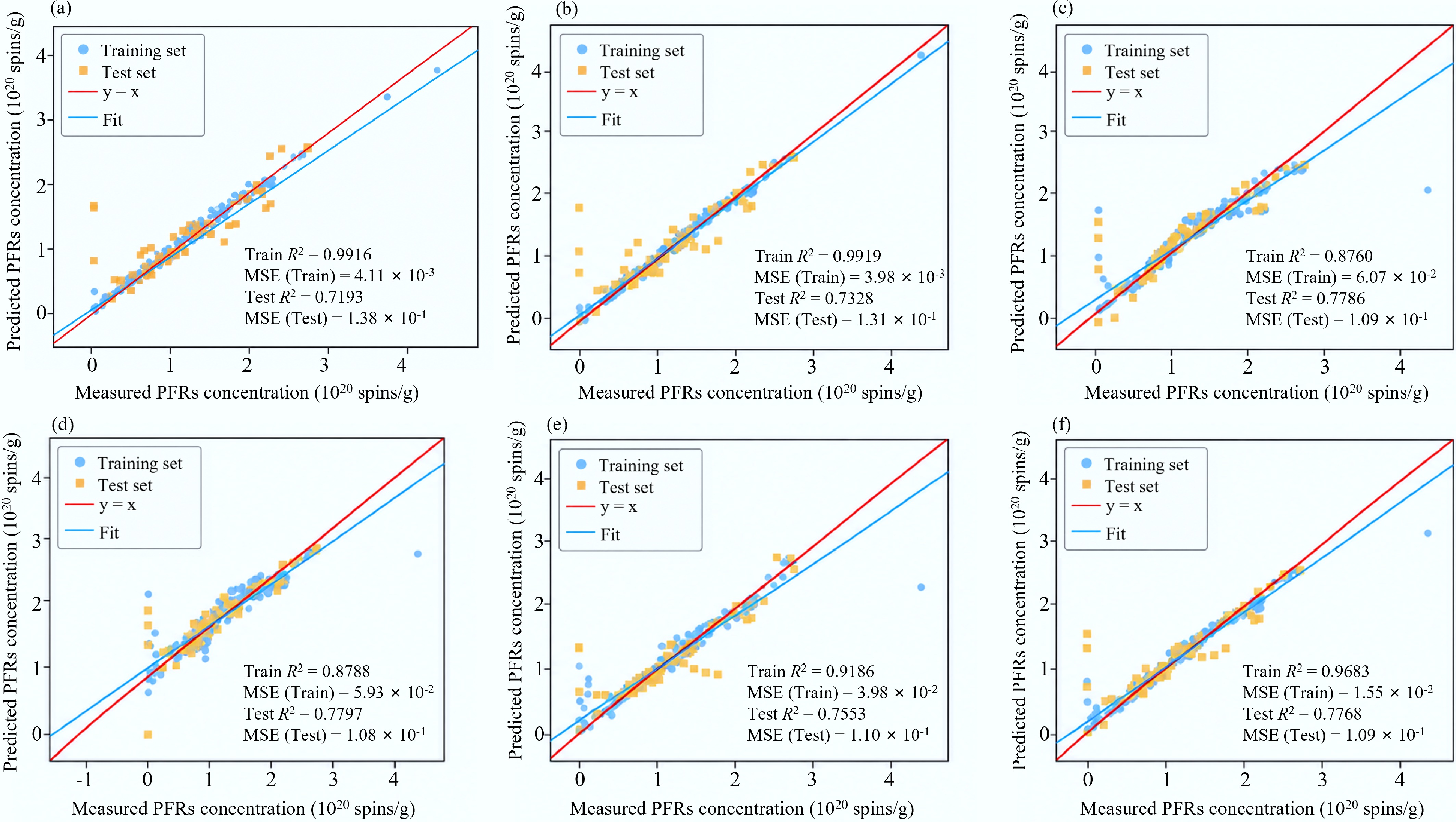
Figure 2.
Regression performance of different machine-learning models for PFRs concentration prediction. (a) XGBoost. (b) Gradient boosting. (c) SVR. (d) Shallow NN. (e) Random forest. (f) Ensemble.
-
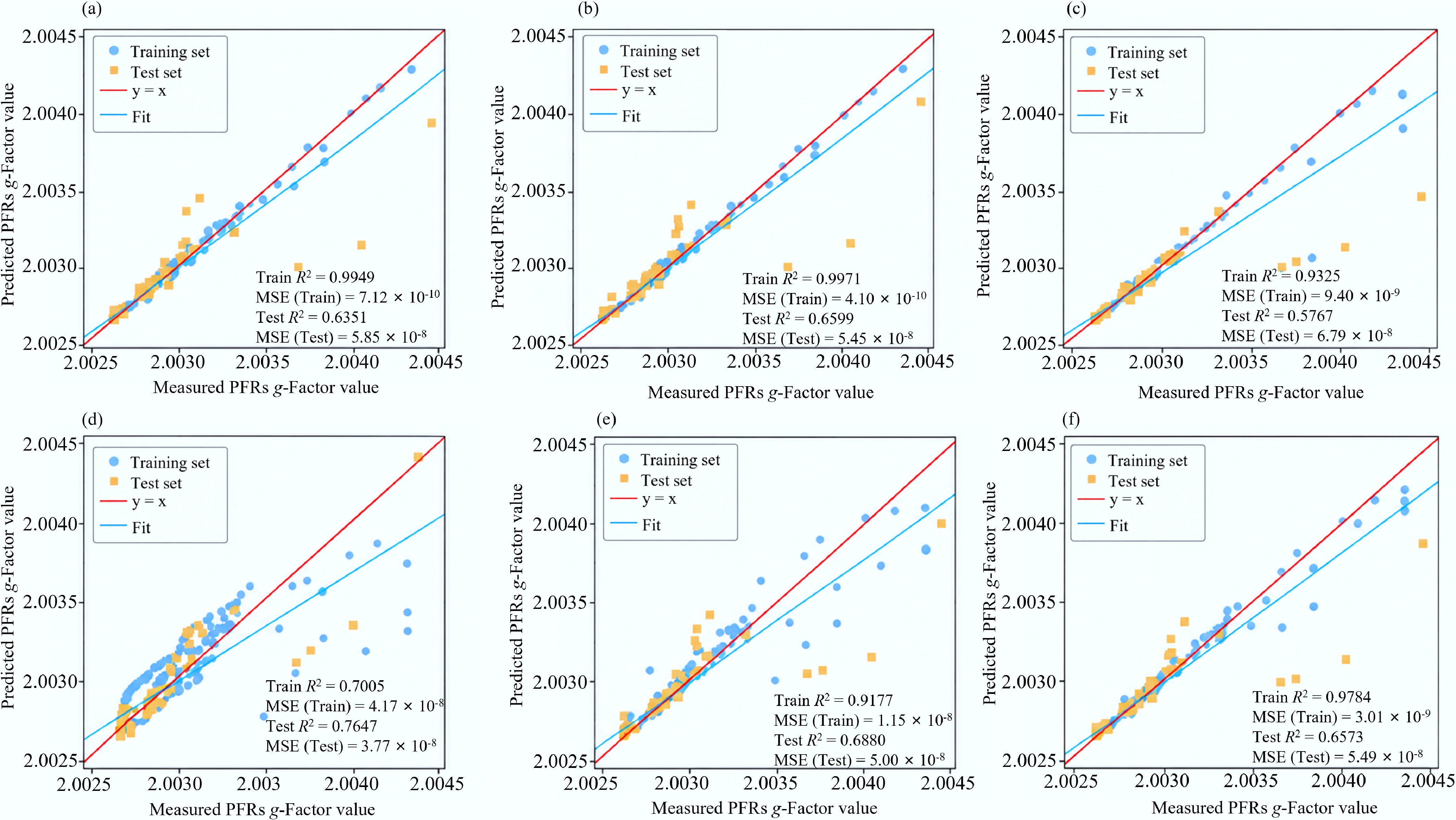
Figure 3.
Regression performance of different machine-learning models for g-Factor value prediction. (a) XGBoost. (b) Gradient boosting. (c) SVR. (d) Shallow NN. (e) Random forest. (f) Ensemble.
-
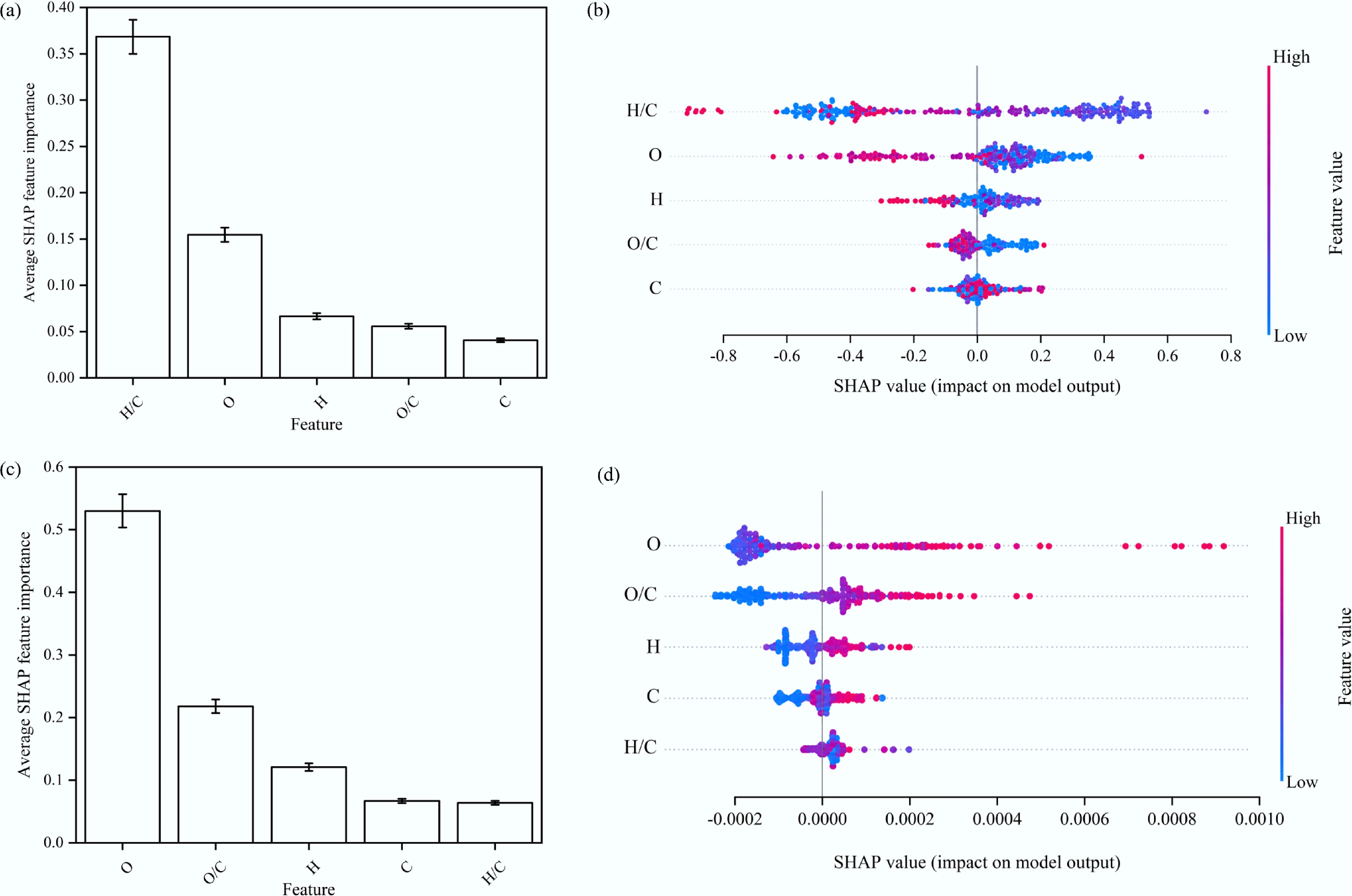
Figure 4.
Relative contribution of each feature based on SHAP feature-importance analysis and beeswarm plots: (a), (b) of PFRs concentration (the top row), and (c), (d) of PFRs g-Factor value (the bottom row). Error bars represent ± 5% of the corresponding mean absolute SHAP values.
-
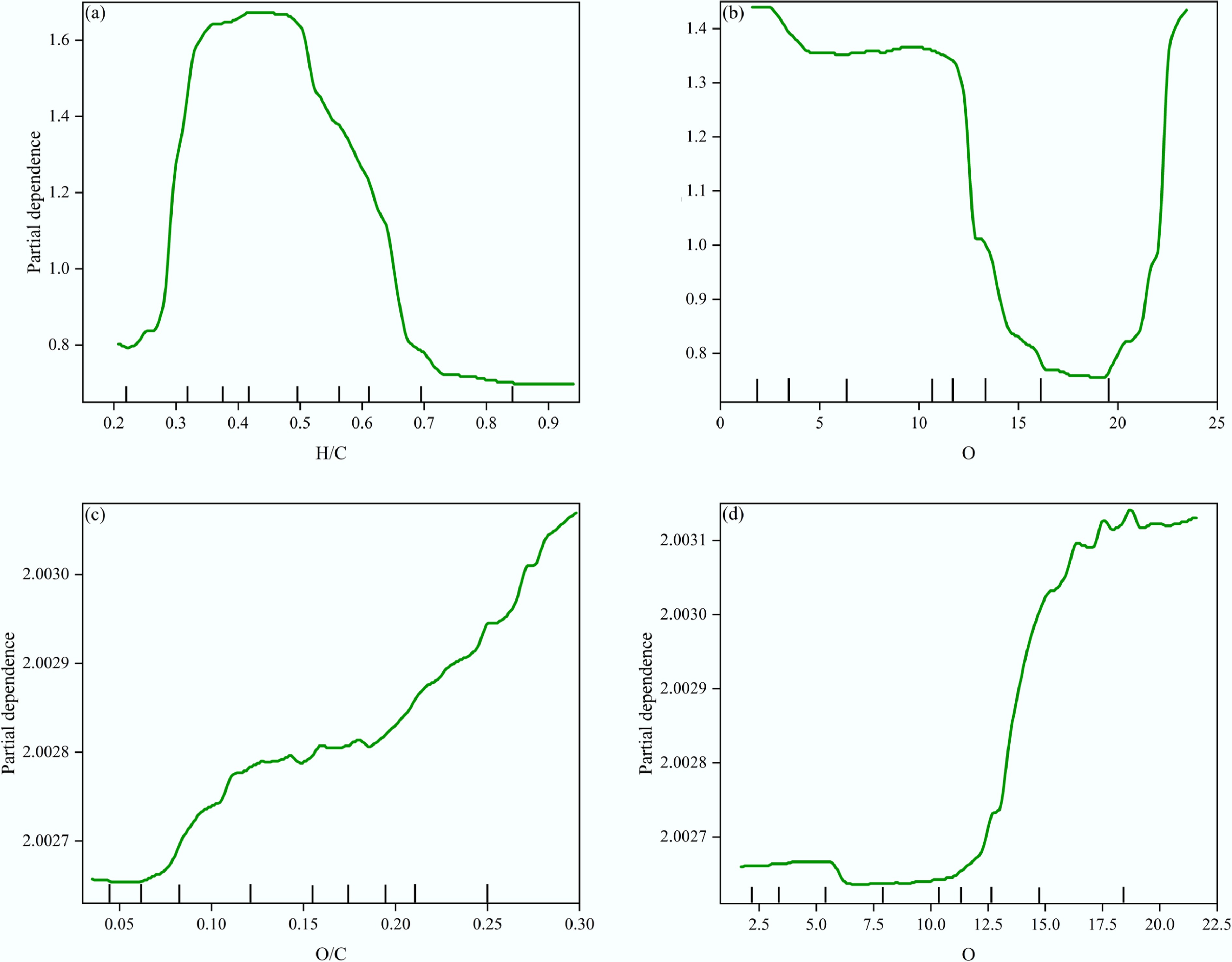
Figure 5.
The univariate PDP analysis on important features: (a), (b) of PFRs concentration (the top row), and (c), (d) of PFRs g-Factor (the bottom row). The tick marks on the x-axis represent the fractiles of target feature values and reflect the data density.
-
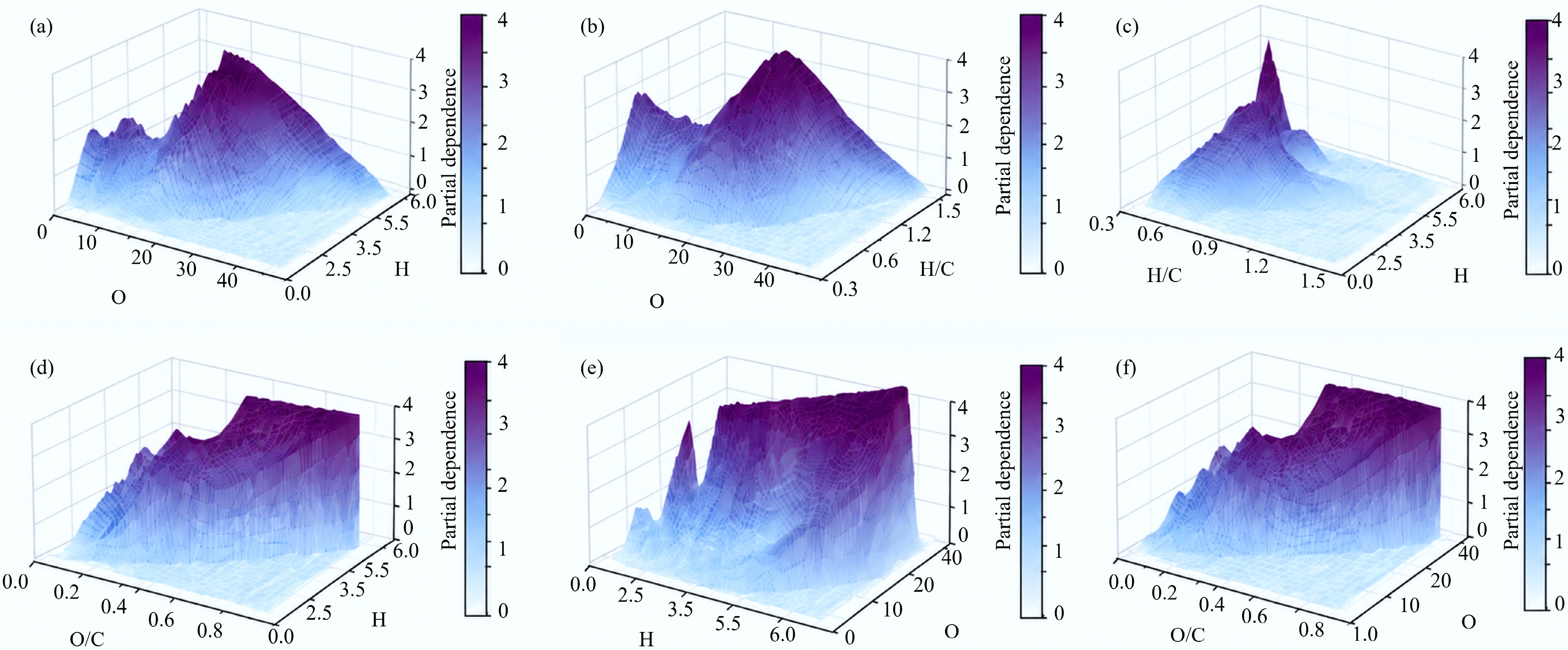
Figure 6.
PDP analysis with two features: (a)–(c) of PFRs concentration (the top row), (d)–(f) of PFRs g-Factor (the bottom row).
Figures
(6)
Tables
(0)